
Wikimedia Apps/Team/iOS/Navigation Refresh
Background
The iOS App has been transitioning from a primarily reader-focused app, to an app that fully supports both reading and editing.
We began adding opportunities for micro-contributions, with article descriptions in 2018. Since then, we have invested in building out notifications and on-wiki communications in 2020, adding Watchlist in 2023, and the Add an Image suggested edit in 2024. As we have added these editing features, the navigation system of the app needs to grow and change to support them and future additions. Improving our navigation will allow for more app users to discover editing features, and allow experienced users quicker access to their most-used tools. This refresh incorporates findings from usability testing with multiple variants of the App's navigation: T351834.
Before embarking on this work, we completed intensive user testing with readers, newcomers, and experienced editors, in English, Arabic, German, and Chinese (Simplified).
Our goals in undertaking this navigation refresh are to:
- Accommodate and promote editing features
- Make notifications more prominent throughout the app
- Accommodate keeping track of multiple articles
- Allowing quick access to key features and customization
- Make it easier to find the donate option
- Demote less popular views (e.g. Places and History)
Feature Requirements
Must have
- Notification entry point should be prominent for any user who could possibly edit, and accessible both from main view & article view
- Entry point for donating should be accessible in less than 1 click from Article view
Explore feed / Main navigation
- Add consistent header with Wikipedia icon, profile option, and tabs (to be built) on all main views
- Remove History and Places from toolbar and incorporate it into search tab
- Profile drawer should contain access to: Notifications, User page (to be built), User Talk page, Watchlist, Contributions (to be built), Donate, Reading Theme, Languages, Settings, Logout / login
- Options in profile drawer should be customizable
- Add Contributions tab that will contain: Entry point to suggested edits, A place where users can eventually see stats about themselves (length of time being a Wikimedian, # of edits and possibly number of saved articles) (to be built), Donation entry point, Donation dashboard / history (to be built).
Article Navigation
- Add consistent header with profile option, and tabs (to be built)
- Add search bar to Article view
- Keep a way for users to navigate back to main navigation view
- There should be quick access to these features from article view:Table of contents, Save to Reading List, Find within article, Theme, Share
- Secondary features available in overflow menu or from profile drawer: Language, Edit History, Talk Page, Watch, Edit full article, Categories (To be built)
- The article toolbar should be customizable (To be built)
Target Wikis
While we welcome feedback from everyone, we are especially interested in hearing from:
Arabic, Chinese, German, and English editors.
In our study, we are committed to fostering a balanced and diverse group of testers. To that end, we aim for a broad spectrum of gender and age representation, ensuring that all perspectives are well-captured and accounted for.
User Stories
- As an experienced editor, I would like quick access to my watchlist in 2 or fewer clicks, so that I can quickly open my watchlist and monitor articles I care about from the App. (T371490)
- As an editor, I would like quick access to my notifications from all screens in the app, so I can see and respond in a timely manner.
- As an iOS user, I would like to customize the article toolbar so I that I can have my most-used shortcuts only 1 click away (T357272)
- As a contributor who uses the iOS app, I would like a place where I can review all of my edits and contributions so that I can quickly revisit something I had been working on. (T275228)
- As a reader, I would like to be able to find the "donate" option easily, so I can quickly donate at the moment I'm feeling grateful for Wikipedia.
- As an experienced editor, I would like there to be an explicit "Contribute" section within the app, so that I can find contribution tools, and so newcomers can find new ways to contribute (T377965)
How will we know we are successful?
- Measured increase in clicks on items that became more prominent through the navigation refresh: Notifications, Watchlist, Suggested edits, and Donate.
Initial Wireframes
-
 Consistent header across top-level views
 -
 Re-ordering of tabs and addition of Contribute tab
 -
 Tabs view
 -
 Updated search screen now contains access to History and Places
 -
 Logged-in view of profile menu
 -
 Logged-out view of profile menu
 -
 Profile menu with unread notifications
 -
 Article view, with access to profile menu and tabs
 -
 Article view with access to profile menu, with unread notifications
 -
 Logged-in view of contribute tab
 -
 Logged-out view of contribute tab


How to Follow Along
We have created T373712 as our Phabricator Epic to track this work. We invite you to collaborate with us there or on our Talk Page. We will provide periodic updates on this page as we make progress.
Phases
In order to accomplish this large body of work, we plan to split up the change to the app into discrete phases. Each phase will improve the navigation, aligned with an annual plan goal.
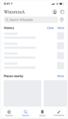
Phase 1: Creating a user Profile Menu (T373714)
This first set of changes introduce a new Profile Menu into the App. This menu will be in the top navigation, and will be accessible from the Explore view, and Article view. For logged-in users, this menu will include quick access to Notifications, User Talk Page, Watchlist, Donate, and Log out. These items will be removed from their existing location within Settings, and Settings will always be accessible from the Profile Menu.
We've heard requests to make the Watchlist and Notifications easier to access from the Article view, and this change will allow users to open Watchlist and Notifications from Article View. We eventually plan to have this profile menu accessible from all main views of the app, add more items into it, and make it customizable.
-
 The profile menu will be accessible viewing an Article
 -
 The profile menu will also be accessible from the Explore tab (Where Settings was previously)
 -
 View of the Profile menu for logged-in users
 -
 View of the Profile menu for logged-out users


Increased accessibility for the "Donate" button
This change will also make the donate button easier to access from article view, aligning with Annual Plan objective around Reader and Donor Experiences. Our initial hypothesis (3.2.3) is If we make the “Donate” button in the iOS App more prominent by making it one click or less away from the main navigation screen, we will learn if discoverability was a barrier to non banner donations.
Previously, to navigate from an article to "donate", it took 3-4 clicks. This navigation change will reduce the clicks from article view to donate to only 2 clicks (Profile > Donate).