Čtení/Web/Vylepšení počítače/Úložiště/Wikimania Stockholmská výzkumná zpráva

Wikimania provided us with the opportunity to speak with experienced members of our communities. Over the five days of the conference we were able to share the plans for our upcoming Desktop improvements project, and collect valuable feedback on a number of design ideas. Our research consisted of user interviews, a free-form feedback exercise, and a presentation with breakout groups for focused discussion.
Below is an overview of the user interviews by feature. We interviewed 18 Wikimedians in total. You can also view this research report as a slide deck.
Main navigation / collapsible sidebar

The sidebar contains a lot of useful tools for editors, however is seldom used by casual readers. Making the sidebar collapsible (collapsed by default for logged-out users, and expanded by default for logged-in users) provides a more focused reading experience. Link to prototype
Feedback overview:
- There was general support for this idea. People agreed that this capability is useful and that a collapsed sidebar makes a lot of sense for readers.
- The links in the sidebar are currently disorganized and many of them are rarely used by readers or editors, though that’s somewhat of a separate issue.
- Tradeoff between a focused reading experience and the opportunity for people to explore areas they might not otherwise
- Is the hamburger icon globally recognizable?
- By showing fewer entry points for contribution, maybe the ones we do show (e.g. Edit, Talk, etc.) will get more engagement
Quick score: support (9 support, 3 neutral, 1 dislike)
Notes/responses to feedback: An additional idea we discussed, and heard support for, but is not part of the prototype is having the sections within the sidebar be collapsible as well:

For more information on this focus area see Research and design: Phase 2#Main sidebar navigation.
Language switcher

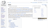
Currently the language links are located in the sidebar, often below the “fold” of the page. Moving language switching to a more prominent location could facilitate easier switching and a greater awareness of Wikipedia’s multilingual offerings. Link to prototype
Feedback overview:
- There was general support for this idea. People agreed that the language switcher deserves a more prominent location, and liked the placement near the article header.
- There were some concerns around the idea of collapsing languages (as opposed to displaying the full list).
- Make sure to use the full language panel with search and settings. This ensures that when you have many languages it’s still a good experience.
- Could we make it even easier to switch to the desired language? Use geolocation and try to predict?
- Could we use a more obvious icon?
Quick score: support (9 support, 1 neutral, 2 dislike)
Notes/responses to feedback: The main takeaway from our conversations are that in the cases where people are likely to change languages a dropdown menu may not be sufficiently discoverable. It might therefore make sense to have two different treatments:
-
Emphasized language switching buttons
-
Emphasized language switching buttons on a scrolled page
-
Full language panel
Search

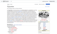
Currently the search field is a relatively small element and is only accessible from the top of the page. Increasing the size and prominence of the search field, and making it always available regardless of scroll position would encourage greater exploration and learning. Link to prototype
Feedback overview:
- There was general support for this idea. People liked search being more obvious and liked the fixed header that made it available from anywhere on the page.
- Could we hide it while scrolling down the page and reveal it upon scrolling up (to preserve as much reading space as possible)?
- What additional items might be valuable in a fixed header?
- What will happen as a result of the logo getting smaller?
- Include images and descriptions in the search results list
Quick score: support (10 support, 1 neutral, 1 dislike)
Notes/responses to feedback:
-
Search results with images and descriptions
-
Search is still available but minimized
Article navigation / table of contents

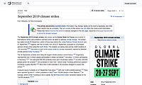
Many popular articles are quite long. How do users navigate within articles to find what they're looking for? Currently the table of contents is only accessible from the top of the page (below the lead section). Making it always available regardless of scroll position might allow people to more easily navigate within articles, helping them to find the information they are looking for more easily. Link to prototype
Feedback overview:
- People mentioned that they don’t use the table of contents often, though they do jump between the top and bottom of the article often.
- Table of contents is less useful for short articles
- The placement in the prototype felt unnatural to people
- People liked having a fixed article header, and wondered what other elements could be included for logged-in users, e.g. article tools (see Article tools section for further exploration of this)
Quick score: support/neutral (5 support, 4 neutral, 0 dislike)
Notes/responses to feedback: For both this prototype and the search prototype people were intrigued by the idea of a fixed/sticky header and what elements would be useful to have there. There could potentially be a fixed/sticky site header (search, user tools, etc.) as well an article header (article title, toc, page tools, etc.). It could also be possible to combine these into one header. Follow up sketches (more specifically just about article navigation / table of contents):
-
Table of contents triggered by clicking on the article title
-
Table of contents as a more fixed sidebar on the page
User tools

By consolidating the user tools in a single menu the interface becomes less cluttered and more welcoming to people who have just created an account for the first time. It also provides a more flexible foundation for introducing additional features in the future. Link to prototype
Feedback overview:
- There was general support for this idea. People appreciated the cleaner interface.
- Could it be configurable such that you could choose one or two items to expose as icons outside of the dropdown menu?
- Note that several popular gadgets add links to this area (e.g. UTC Clock gadget)
Quick score: support (5 support, 1 neutral, 0 dislike)
Notes/responses to feedback: Anticipating the need some people will have to expose certain items outside of the menu it would be great if it was easy to specify certain pages and expose them via icons:
-
Sketch of watchlist and contributions as icons outside of the user tools menu
Article tools

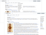
Currently some article tools are in the sidebar whereas others are in the article toolbar. By consolidating the tools in the article toolbar we can create a more intuitive page structure. Also by optionally collapsing them into a menu (at least for logged-out users) we can create a cleaner experience. Link to prototype
Feedback overview:
- General agreement that consolidating page tools would be an improvement
- Some editors use these items very often and expressed concern about the additional click required to access them
- Note that several popular gadgets add links to this area (e.g. Twinkle)
- A more descriptive name for the menu (e.g. Page tools) would be helpful
- People would like to be able to access these tools regardless of scroll position on the page
Quick score: neutral (3 support, 5 neutral, 1 dislike)
Notes/responses to feedback: Out of all the features we discussed this one stands out in terms of the needs of editors/logged-in users being very different from the needs of readers/logged-in editors. We know from looking at the data that a very small percentage of logged-out users interact with page tools[citation needed], however we heard that easy access is important for editors.
-
Page tools as a pin-able menu
-
Page tools as a pin-able menu (scrolled page)
Free-form feedback exercise


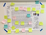
During the three days of the conference we also displayed a poster of a redesigned desktop interface in a main walkway, with the prompt “Let’s improve desktop. Thoughts?”. We placed post-its and markers on a shelf underneath the poster. This resulted in 77 comments (we cleared the post-its off periodically when the poster got full). While all of the feedback and ideas were helpful the ones shown below came up more than once (meaning either more than one person wrote it on a post-it, or people added “+1” to existing post-its).
|
Sidebar navigation
|
Content & TOC
|
Article toolbar & menu
|
|
Editing / getting involved
|
Misc.
|
Notes/responses to feedback:
-
Emphasized Edit button
-
Emphasized Discussion button on a protected page
-
Emphasized History button on a protected page
-
New article button in site header
-
Reading preferences panel
-
Sketch of an article activity stats panel
-
Sketch of a "more radical" interface update
Presentation and brainstorm

The presentation took place on the final day of Wikimania in the New Readers space. It was an opportunity for us to share the general outline of the project with the community (scope, timeline, etc.) as well as showcase some of the sketches and ideas. Responses were consistently positive and encouraging, even if cautionary at times.
-
Olga presenting about the desktop improvements project at Wikimania 2019
-
One of the breakout groups during the brainstorm
-
Post-its on Vector poster from brainstorm session
The brainstorm generated many questions and ideas, many of which we've included with the results of the free-form feedback exercise. Some overall themes that emerged:
- Different people have different needs. This applies when thinking about readers vs. editors, but even among editors there are a variety of different needs.
- The interface should be more modular and configurable. This need, especially among editors, is clear from the popularity of gadgets and user scripts that exist. How can we formalize this and make it easier to customize the interface to your needs?
- The interface should be less dense, especially for readers. There was agreement that over time a lot of clutter has built up in the interface and it would be an improvement to reorganize it such that there's more emphasis on the content rather than the navigation and chrome.
Research report as slides


