OOUI/Widgets/Popups
| OOUI |
|---|
| Introduction |
| Getting started |
| Working with widgets |
| See also |
A PopupWidget is a container for content. Popups are overlaid and positioned absolutely. The width, height, and padding can be customized using configuration options. By default, each has an ‘anchor,’ which is an arrow-like protrusion that points toward the popup’s origin.
Create a popup and add content using the $content config:
// This example illustrates a simple popup. Width and height are specified in pixels. By default, the width is 320 pixels and the height is the automatic height. If 'padded' is set to 'true', padding will be added to the popup body. Content is appended to the popup body using the $content config.

var popup = new OO.ui.PopupWidget( {
		$content: $( '<p>Hi there!</p>' ),
		padded: true,
		width: 300
	} );

$( document.body ).append( popup.$element );

// To display the popup, toggle the visibility to 'true'.
popup.toggle( true );
Add a close button and label to the top of the popup with the head and label options:
// Set the 'head' config to 'true' to add a header that contains a label (when specified) and close button.
var popup = new OO.ui.PopupWidget( {
		$content: $( '<p>This popup has a header that contains a label and a close button. Note that labels are only used in the popup head. If no label is set, only the close button will appear.</p>' ),
		padded: true,
		width: 300,
		head: true,
		label: 'The PopupWidget label'
	} );

$( document.body ).append( popup.$element );
popup.toggle( true );
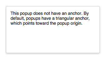
Specify whether the popup should have an anchor or not with the anchor option:
 // Set the 'anchor' config option to 'false' to remove the triangular anchor that points toward the popup origin.
var popup = new OO.ui.PopupWidget( {
		$content: $( '<p>This popup does not have an anchor. By default, popups have a triangular anchor, which points toward the popup origin.</p>' ),
		padded: true,
		height: 150,
		width: 300,
		anchor: false
	} );

$( document.body ).append( popup.$element );
popup.toggle( true );
Align the popup with the align option. Alignment can be set to center, force-left, force-right, forwards, or backwards.
<!-- Align the popup from the center, left, or right. The forwards and backwards alignments flip the direction of the popup body to match the direction (left-to-right or right-to-left) of its context -->

<style>
body {
	font-family: sans-serif;
	font-size: 0.875em;
}
.my-position1 {
	position: absolute;
	left: 300px;
	top: 250px;
}
.my-position2 {
	position: absolute;
	left: 300px;
	top: 300px;
}
.my-position3 {
	position: absolute;
	left: 300px;
	top: 350px;
}
</style>

<script>
var popup1 = new OO.ui.PopupWidget( {
		$content: $( '<p><b>align=center</b></p><p> The popup is centered to the anchor, the default.</p>' ),
		padded: true,
		width: 300,
		classes:  [ 'my-position1' ],
		align: 'center'
	} ),
	popup2 = new OO.ui.PopupWidget( {
		$content: $( '<p><b>align=force-right</b></p><p> The popup body is aligned to the right of the anchor in both left-to-right and right-to-left contexts </p>' ),
		padded: true,
		width: 300,
		classes:  [ 'my-position2' ],
		align: 'force-right'
	} ),
	popup3 = new OO.ui.PopupWidget( {
		$content: $( '<p><b>align=force-left</b></p><p>The popup body is aligned to the left of the anchor in both left-to-right and right-to-left contexts</p>' ),
		padded: true,
		width: 300,
		classes:  [ 'my-position3' ],
		align: 'force-left'
	} );
$( document.body ).append( popup1.$element, popup2.$element, popup3.$element );

popup1.toggle( true );
popup2.toggle( true );
popup3.toggle( true );
</script>
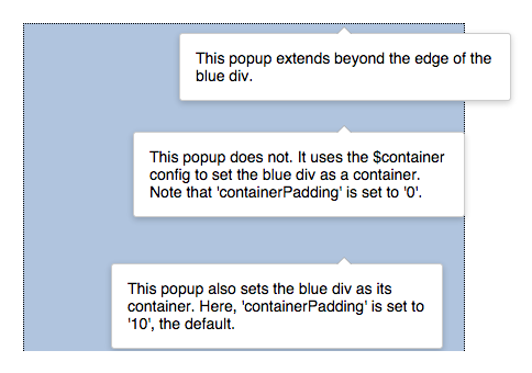
Set a container and container padding with the $container and containerPadding options:
<!-- Constrain a popup to the boundaries of a specified container using the
$container option. The amount of padding between the edge of the popup
and the container is specified with the 'containerPadding' option,
which defaults to 10 pixels. -->
<style>
body {
	font-family: sans-serif;
	font-size: 0.875em;
}
.my-position1 {
	position: absolute;
	left: 300px;
	top: 10px;
}
.my-position2 {
	position: absolute;
	left: 300px;
	top: 100px;
}
.my-position3 {
	position: absolute;
	left: 300px;
	top: 220px;
}
.bluediv {
	width: 400px;
	height: 300px;
	background-color: #b0c4de;
	border-style: dotted;
	border-width: 1px;
}
</style>
<div class="bluediv"></div>

<script>
// popup2 and popup3 are contained by the div specified as a jquery selection in the '$container' config. Note that the padding between the containing div and the popup is controlled with the 'containerPadding' option.

var popup1 = new OO.ui.PopupWidget( {
		$content: $( '<p>This popup extends beyond the edge of the blue div.</p>' ),
		padded: true,
		width: 300,
		classes:  [ 'my-position1' ],
		align: 'center'
	} ),
	popup2 = new OO.ui.PopupWidget( {
		$content: $( '<p>This popup does not. It uses the $container config to set the blue div as a container. Note that \'containerPadding\' is set to \'0\'.</p>' ),
		$container: $( '.bluediv' ),
		containerPadding: 0,
		padded: true,
		width: 300,
		classes:  [ 'my-position2' ],
		align: 'center'
	} ),
	popup3 = new OO.ui.PopupWidget( {
		$content: $( '<p>This popup also sets the blue div as its container. Here, \'containerPadding\' is set to \'10\', the default.</p>' ),
		$container: $( '.bluediv' ),
		containerPadding: 10,
		padded: true,
		width: 300,
		classes:  [ 'my-position3' ],
		align: 'center'
	} );

$( document.body ).append( popup1.$element, popup2.$element, popup3.$element );

popup1.toggle( true );
popup2.toggle( true );
popup3.toggle( true );
</script>
Automatically close the popup when it loses focus with the autoclose (and, optionally, $autoCloseIgnore) options:
<!-- This example uses the PopupWidget's 'autoClose' option to close the popup
automatically when it loses focus. Note that the '$autoCloseIgnore' option
is used to specify an element ( 'button') that should never impact the autoclose
behavior. Were the '$autoCloseIgnore' option not set, all subsequent clicks to
'button' would rapidly close and then reopen the popup. -->

<style>
body {
	font-family: sans-serif;
	font-size: 0.875em;
}
.my-position {
	position: relative;
	left: 50px;
	top: 50px;
}
</style>

<script>
var button = new OO.ui.ButtonWidget( {
		label: 'Open the popup!',
		icon: 'menu'
	} ),
	popup = new OO.ui.PopupWidget( {
		$autoCloseIgnore: button.$element,
		$content: $( '<p>This popup will close when it loses focus (\'autoclose\' is \'true\'), except when the \'Open the popup!\' button is clicked. This button is ignored, as specified in the $autoCloseIgnore config). </p>' ),
		padded: true,
		width: 300,
		align: 'forwards'
	} ),

// Create a Fieldset layout.
	fieldset = new OO.ui.FieldsetLayout( {
		classes: [ 'my-position' ]
	} );

// Use the `addItems()` method to add Fields that contain the button and popup to the FieldsetLayout.
fieldset.addItems( [
	new OO.ui.FieldLayout( button ),
	new OO.ui.FieldLayout( popup )
] );

// Define and attach the event handler to the button.
button.onClick = function () {
	popup.toggle( true );
};
button.on( 'click', button.onClick );

// Append the fieldset to the DOM.
$( document.body ).append( fieldset.$element );
</script>
You can also achieve this effect using the built-in PopupButtonWidget class.
For a complete list of supported methods and configuration options, please see the code-level documentation.
OOUI is maintained by the Design System Team.
Get help:
|


