Wikimedia Apps/Team/iOS/Nearby
This page is obsolete. It is being retained for archival purposes. It may document extensions or features that are obsolete and/or no longer supported. Do not rely on the information here being up-to-date. |
Summary
[edit]Improve user engagement and usage of the Nearby feature as another primary way to discover and explore articles in the iOS app.
What is the ultimate goal/vision for this project?
[edit]Extend and improve the use of geolocation as a primary method for users to find and explore encyclopaedic content.
What is the short term goal/need for this project?
[edit]Improve user engagement with the Nearby feature by:
- Moving Nearby to its own tab in the tab bar
- Adding an ability for users to view results in a map or list view
- Updating the geolocation in real time when the Nearby tab is active
- Allow searching on map and/or filtering
- Ranking or sorting of search results
- Additional animations, transitions and flash to help drive up engagement for this “novelty feature”
Why are we doing this?
[edit]Low usage of the Nearby feature, which we hypothesize to be due to a combination of low prominence of the feature (buried as the 4th or lower card on the Explore feed) as well as the lack of map view and associated searching, sorting and filtering capabilities that is usually available on equivalent applications with a map view.
Additionally users have frequently highlighted the Nearby feature as unique and well liked app feature, and requested easier and more complete access to geo based browsing and discovery in comments on OTRS, iTunes and in press reviews.
How would we like users to solve this problem or discover this solution?
[edit]Putting “Nearby” into its own tab and redesiging this tab with Map view and associated tools for navigating content overlaid onto map views.
How do we know we’ve been successful?
[edit]Increased usage of the Nearby feature, including increased clicks on geographically relevant articles and increased downstream pageviews. Additionally we would expect to see positive comments in press, on OTRS and in iTunes reviews on launch.
Design Goals and Stories
[edit]Design Goals
[edit]- Increase discoverability - many users did not know ‘Nearby’ existed in iOS prior to v5.0.0 and now it is in the Explore feed, but is still buried below many other sections in the feed.
- Better consistency - Nearby is on a separate tab in Android.
- Improve search and discovery experience – leverage mobility and location of device apps.
Personas
[edit]The personas upon which detailed user stories are based will be Sandra (Casual Reader) and Michelle (Active Reader). Personas can be found here.
Key User Stories
[edit]V1
[edit]Increase the discoverability and engagement of the Nearby feature to improve the basic user story for exploring with Nearby.
User story: iOS user exploring Nearby content
[edit]When browsing Wikipedia and interested in articles nearby, I want to be to switch to a map view to see visually how close various articles are to my current location in real time.
Currently:
- Nearby resides in the Explore feed as another card, and is not very prominent.
Proposed:
- We hypothesise that moving it out to its own tab will place it in a more obvious place for exploration in parallel to the Explore feed.
- Introducing map view for articles using real-time location will help improve user engagement
- Introducing sorting and filtering capabilities will also improve the experience of discovering different types of encyclopaedic content based on different nearby location definition (by zoom level) and allowing users to filter articles based on different categories or keywords.
Core interaction flow
[edit]- Open app and tap on the Nearby tab
- Nearby tab loads in Map view with current location shown as well as top X locations as pins
- User taps on a single pin and sees a preview card of the article selected
- User taps to toggle to list view of nearby locations
V2
[edit]Extend the capability of ‘Nearby’ to improving the overall experience of search and discovery based on geo-location, not limited to only regions “near” the user’s current location.
User story A: Traveller
[edit]When I am planning for a trip, I want to use Wikipedia to search and pin interesting content around where I will be going so that I can incorporate visiting places of interest into my itinerary.
User story B: Researcher/Student
[edit]When I am researching a topic where the location is a focal point, I want results of articles and article sections to be visible in a map view so that I can use the map view to parse/filter articles I am interested in further.
Specific stories for research via a ‘map’ out include:
- Exploring Ivy League universities in the US or Colleges of the University of Cambridge
- Exploring the life and travels of Albert Einstein
- Mapping the locations in the plot of On the Road “On the Road”
Initial Designs
[edit]Version A: Map-based main view with single article cards
[edit]Description:
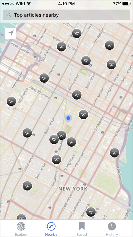
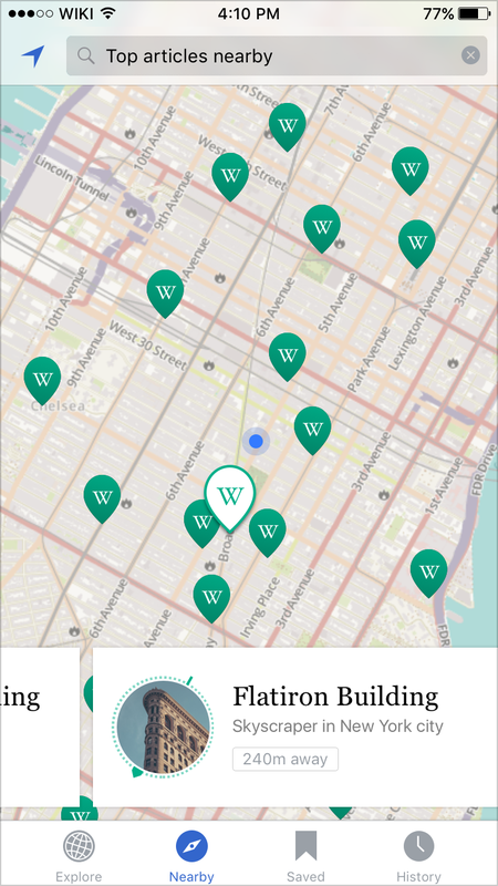
[edit]Show the top X number of articles nearby as pins in a full-screen map view, with a single pin highlighted showing a ‘card’ previewing a single article.
- Version A - Map with single card preview
-
Default view for version A.
-
Single preview card shown (when a pin is tapped).
-
Scrolling up on the article preview card will load the full article for the reader.
Known Pros:
- Immediacy of entire map view showing users top articles nearby their location
- User can get swipe left and right to view a ‘feed’ of all cards within the map (as well as being able to tap on pins to show pertinent preview card)
- User is able to ‘save for later’ immediately from the article preview
- Fast action to read the full article by either swiping upwards or tapping on a card.
Known Cons:
- User is not able to see a ‘list view’ of top articles at once (as it exists now) and therefore cannot browse through a series of articles as quickly
- Swipe left/right on card interaction may not be so discoverable
- Large card over map obscures the user’s current location, making navigation unclear
Version Ai - variation to A with alternate pins and card design:
[edit]- Version Ai - style variation to version A
-
Variation Ai to Version A – with different visual styling for cards and pins.
-
Variation Ai to Version A - showing horizontal scrolling tile behavior.
Additional pros to Version A:
- Card styling makes the scrolling gesture more clearer
- Smaller cards with compass icon make navigation easier
Additional cons to Version A:
- Simplified smaller cards means no preview blurb and ‘Save for later’ functionality
Version B: Split view with both map and article list
[edit]Description:
[edit]Familiar ‘Apple Maps’ style layout with a split map and list view.
- Version B - Split view with both map and list
-
Version B - default view showing both article list and map. Modeled on the Apple Maps UI.
-
Version B - view when either an article 'pin' or the corresponding list item has been tapped.
Known Pros:
- Users are familiar with the Apple maps-like layout and interaction patterns
- Able to see both map and list view together with option to view as a whole map entirely
Known Cons:
- Not able to get a full preview of each article (intro paragraph, lead image)
- Unable to ‘save for later’ from list view
- Address information in pin popover not applicable for all articles
Version C: Toggle between map and list views
[edit]Description:
[edit]Defaults to a full map view; which can be toggled to a full list view of nearby articles.
- Version C - Toggle map/list view
-
Version C - Default map view with a pin tapped to show example pop-over.
-
Version C - example card when user force-touches on a pin.
-
Version C - Toggled to list view.
Known Pros:
- Full map view with force touch to show each preview encourages behavior to discover via navigating on the map
- Able to toggle to full list for users who wish to browse through multiple items with the intention to select specific articles to read
- Thumbnail pin allows user to more directly associate an article with its location
Known Cons:
- Discoverability of the toggle between the two views
- Not able to immediately get a full preview of each article (intro paragraph, lead image) in either list or map view
- Unable to ‘save for later’ from list view
- Thumbnail style pin may be cluttered when there is a high density of articles
- Address information in pin popover not applicable for all articles
Cross-cutting Design Questions
[edit]In any of the flows conceived above there are several design and interface questions we'll need to answer.
Supporting Search and Filters
[edit]Many user stories rely on the ability to search and filtering the Nearby articles. This is currently not supported on any platforms, so raises some additional questions:
- Expectation from user if entering a search term?
- What top canned categories would users want/expect?
- Is the expectation that there can be multiple canned category ‘tags’ or one tag combined with a search term? (And are these ‘AND’ or ‘OR’ search queries?)
- Ability to sort by:
- popular/most visits
- relevance
- article quality
Other
[edit]- Pin visual style options:
- Drop/Circle/Callout shape
- Colour - teal or dark grey
- “W” icon, article thumbnail, or none?
- Current location – are users able to discover how to return to their current location if they had moved the map area? (Do they recognise the iOS icon for current location?)
- Compass element – keep the compass in the current app version (v5.0)?
- Get Directions functionality – currently in Android version. Is this useful to add?
Additional Product Considerations
[edit]Tile Server
[edit]Tiles could be served via Apple maps or Wikimaps. Note that this is specifically a choice about which tile server to use, and doesn't affect Wikipedia data or search (100% Wikimedia) or basic map controls/UX (100% Apple MapKit).
- Downsides to Wikimaps:
- Will require styling
- API limitations (radius, etc)
- Downsides to Apple Maps:
- Not freely licensed
- Consistency with Android and Web map views
Potential filters and ranking for Nearby items:
- Rank by pageviews
- Pagerank (search ranking against keyword)
- Article quality (Featured, Good, etc)
- Distance (existing)
- Wikidata based categories (eg. "buildings")
- Categories ("Historic buildings in Brooklyn" --> unlikely to scale outside en)
Additional integration points for maps outside Nearby tab:
- Insert a map or directional content to articles with geotags automatically
- In app support for Kartographer and editor inserted maps (blocked on mobile layout issues with Kartographer)
Existing Features Research
[edit]- Wikipedia Android app implementation
- Built with the help of volunteers in 2015 Hackathon in France
- Low engagement in the current version (although there was a boost in engagment in the months following launch, that has settled to previous levels).
- Existing research and feedback on Wikipedia iOS
- Labs feedback on navigation issue with the Explore feed on discoverability issues for Nearby
- Feedback from users via OTRS and other forums (press, iTunes reviews)
- This feature exists as a Special page on browser, and is in the "main" menu of MobileFrontend. However we could locate is no existing research about its use or development in the browser version(s) of Wikipedia.
Reference Designs
[edit]What products are being used to solve this or similar problems?
- Current Android Wikipedia app
- iOS Wikipedia-reading apps
- Inquire
- Viki
- Wikiwand
- Other iOS apps with map views to explore
- Poetic places
- National Geographic City Guides (by Rally interactive)
- Expedia
- Foursquare
- AirBnb
- Other notable map apps
- Google maps
- Apple maps
- HERE Maps


