Translation UX/Wireframes B
Appearance
Proposed by Arun
Find and Translate:

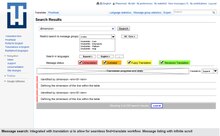
The screens should be self explanatory, but here is a short description: the translation process can be essentially broken down to 3 steps:
- Search or fetch messages/translation of interest
- Translate messages that require translation
- Edit/review existing translations
My focus was on making this workflow as seamless as possible without the need for switching pages. This way the entire translation workflow is less confusing to a user and he can easily optimize his workflow for the type of tasks he wishes to perform.
The current system of splitting translate and proofread as separate process has resulted in proofreading being ignored as a secondary activity.
