Jump to content

Topic on Help talk:Extension:Kartographer/Icons

JMF (talkcontribs)

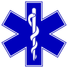
The icon for "hospital" is needlessly religious. It would be more appropriate to use a religiously neutral and widely recognised symbol: the Star of Life. Unfortunately that is (a) copyright and (b) too complicated for an icon. So I want to propose a close analogue: <big>✱</big> (U+2731 ✱ HEAVY ASTERISK).

To understand how the current icon looks from non-Christian perspective, see the Red Cross and Red Crescent symbols.

What needs to happen for this proposal to be adopted?

Mkouklis(2) (talkcontribs)
JMF (talkcontribs)

True but surely it is far too complex to use as an icon, especially a map icon where it has to fit in the "tennis racket" symbol?

Of course if someone is willing to develop it and see the effect, go right ahead. The 'heavy asterisk' is plan B. --JMF (talk) 23:30, 5 May 2024 (UTC)

Romaine (talkcontribs)

The symbol for the Red Cross is NOT religious. However, I agree that a better symbol would be welcome.

JMF (talkcontribs)

Originally not consciously but yes it is. That's why the modern organisation is called "International Red Cross and Red Crescent Movement" (and btw they don't like their emblems being used for anything else).

Fwiw, the red cross originates from the Swiss flag: a white cross on a red background - a Christian symbol for religious reasons.

It also has the (superficial, I admit, but at first sight) effect of implying that the location shown is a Christian place of worship.

Romaine (talkcontribs)

Originally that cross had a religious meaning, but not nowadays. The Swiss Flag is nowadays not considered to be religious and the symbol for the Red Cross also not. Nowadays the † is the symbol for Christianity, the + is a symbol used in the Swiss flag, by the Red Cross and to do mathematics. The use of symbols changed over time. In the Roman period they used at least 8 symbols to indicate Christianity! One of those 8 is now in frequent use in flags of Muslim countries, and certainly not to indicate Christianity.

But let us not focus on what the cross means, meant or can mean, but on improving this icon. There are multiple reasons to have a different icon:

  • As you indicate, the + is a symbol of the Red Cross, and not for hospitals. Indeed the Red Cross does not want to have their symbol used elsewhere, and so far I now that is honoured widely. Also there have been lawsuits to have anyone else (besides Red Cross) stop using the red cross.
  • In many countries where I have been the + is not a symbol for a hospital, but instead for example a H. It would be better to have a symbol that can be used worldwide and not in only a few countries where a + is common (if that is even (still) the case).
  • The (colourless) symbol of a cross is also ambiguous, for example pharmacists and some health care organisations use a green cross, those aren't a hospital. Etc.

So yes again, we need a better symbol.

JMF (talkcontribs)

Agreed. The historical detail is just that, historical.

The reason I suggested 'heavy asterisk' is because it is sensibly scaled alternative to the Star of Life. According to the en.wikipedia, that device has become widely accepted worldwide as a symbol of emergency health care.

If this is to progress, we at least need to show a consensus (a) for change [I think we have that] and (b) what the replacement should be. Do you support ✱ or do you have a better idea?

Romaine (talkcontribs)
Star of Life

If it is just a ✱ without inner symbol, I would not recognise it as hospital, but if it has an inner symbol like here on the right, then yes.

JMF (talkcontribs)

Yes, that would be ideal but, given that the 'pins' are so small, I doubt that it can be done. I'd rather the request didn't fail for a procedural reason.

So let's agree that we propose that the full Star of Life be used if practicable but if not, a blue heavy asterisk (<blue>✱</blue>) is an acceptable fallback.

Reply to "Icon for hospital"