Reading/Web/Projects/Improve in-article language switching on mobile web
The problem
[edit]This is intended to improve the reading experience of users who speak more than 1 language, primarily for those users whose primary language has limited content. It is quite common for such a user to want to see if the article in another language has more content or is more understandable.
See also: Interlanguage links/Implementation comparison.
Goal Visibility
[edit]This is a Readership Goal that is committed externally here: https://www.mediawiki.org/wiki/Wikimedia_Engineering/2015-16_Q3_Goals#Reading
Rationale
[edit]The current language-switching button is buried at the bottom of the article and still gets more clicks than the hamburger menu see mobile report card (table name is 'page-ui-daily').
We have also identified some usability issues with the overlay that appears when the language switcher is opened. It is this latter UX issue that we have started with.
User story 1 : As a user I want to see what other languages an article is available in without scrolling to the bottom of the article.
User story 2: As a user interested in switching the language of the article, I would like to find the language I am interested in as quickly as possible
Success criteria
[edit]Our initial goal was: Increase interaction with language switching by 5% on mobile web.
However, simply raising the prominence of the tool could do this simply by showing the tool to so many more users who might click out of curiosity. The revised goal is to "increase language switching (clicking on button and then selecting a language) by 5% on mobile web,without dropping the conversion rate (# of language switches/ #clicks on tool) to below 40%. "
Logic: This should filter out the impacts of simply raising the profile of the tool, based on the assumption that uninterested users will not actually select a language and switch wikis. We want to protects against simply driving more people into the tool and artificially creating higher engagement at the expense of bothering all the people who click, but are not interested. We do expect that more people will open the tool and then exit out. This will lower the 'conversion rate' (# of language switches/ #clicks on tool), but if it stays above 40% AND raises the overall number of language switches, we feel that this tradeoff is appropriate. The current conversion rate is ~60%, so this will mean that we are willing to accept 50% higher rate of people clicking on the tool and not using it, in exchange for 5% higher rate of language switches. This sounds like a bad tradeoff in %'s, but the cost of an extra click, is much lower than the benefit of discovering and reading a version of the article that is better suited to the reader.
Overall feedback
[edit]This task is being tracked on Phabricator and we'd love to hear your thoughts. The voting here is a good exercise to help us discuss and understand about the different points of view. By the end of the voting period, we should summarize each of the points raised about each proposal and move on from there, meaning, this is a qualitative, rather than quantitative analysis.
[historical] Help us choose the solution
[edit]We will evaluate all the points made, consolidate them and link to the final design when we have one.
------------
We are making strides to get community feedback earlier and earlier in the process. We are excited to be asking for your advice at the solution stage, before we start building, and are really excited to see how this works.
- Duration: For productivity, we have set a timeframe for feedback collection, start as soon as the designs are up (no later than Tuesday February, 23rd 1:00 UTC) and will end Saturday, February 27th 1:00 UTC).
The user story we are trying to solve for is:
- User Story 1 from above: As a user I want to see what other languages an article is available in without scrolling to the bottom of the article.
Below are 3 possible solutions developed by our designers are going to be shown. Under each one, please vote with an optional explanation of why you prefer or dislike that treatment over the others. Voting options:
![]() Support
Support ![]() Oppose
Oppose ![]() Neutral
Neutral
Solution 1: Sticky footer
[edit]Description:
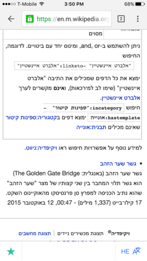
[edit]Sticky footers do a great job at increasing the access to actions. We can create an action bar for articles. in this case, changing language and watchlist seems to be good candidates for "doing something no matter where you are in the article"
- View on mobile device
-
Language button on sticky footer - shows current language code
-
Sample right to left language page
-
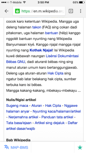
Sample page with long language codes
- Mobile view on desktop
- Live prototype:. This can help you check the feature in a live demo.
Known Pros:
- Access to changing language no matter where you are
- Add articles to watchlist while you are at the bottom of the article, no need to scroll all the way up
- Creates a space for future article actions
- Already tested on native apps
Known Cons:
- Mobile browsers who don't support fixed position or poorly support will not have this feature
- Sticky footer will take up vertical space on small screens
- Time to implement is more
Votes (it helps to sign next to the vote)
[edit]| Vote | Comments |
|---|---|
| Familiar mobile interface + easy to access TNegrin (WMF) (talk) 15:34, 24 February 2016 (UTC) | |
| J'aime beaucoup. (Par contre, pas très pratique) Tyseria (talk) 12:49, 24 February 2016 (UTC) | |
| I like this. Being always visible is a big plus (could work at the top as well). Can be reused for some other actions, too, such as an edit button! (But please, put the whole language name there and not a 2–3-letter code.) Amir E. Aharoni (talk) 13:35, 24 February 2016 (UTC) | |
| I think same than Amir's statement. Better with whole language name and adding edit button.--Kippelboy (talk) 14:06, 24 February 2016 (UTC) | |
| |
| Sticky footers are hard to get right. On the fundraising side, we've heard a lot of arguments against them... I don't think it's a great idea to put them over every article forever. | |
| Takes too much space on mobile since you cannot scroll it away or minimize it. BSitzmann (WMF) (talk) 19:00, 23 February 2016 (UTC) | |
| As important as language switching is, it's not important enough to occupy a non-dismissable bar of precious pixels on an already space-constrained display. DBrant (WMF) (talk) 13:05, 24 February 2016 (UTC) | |
| I preffer that option more than 3 but i still love 2 the most. Mikey641 (talk) 14:08, 3 March 2016 (UTC) | |
| If research states there are more clicks with a sticky footbar, I'd agree to have it enabled. However, I'd like to avoid using iso language codes in favour of the complete name of the language. --ESM (talk) 17:35, 24 February 2016 (UTC) | |
| This would be great for tablet users but I think it is a mistake for mobile users as for the majority of people who just want to read it will get in the way. We've had many complaints about the thank button in the mobile diff which uses a fixed footer. Jdlrobson (talk) 23:01, 24 February 2016 (UTC) | |
| Most users don't need to switch all the time between languages. This option takes too much space from the reading screen, which is already too small in smartphones. בנימין (talk) 16:52, 27 February 2016 (UTC) | |
| The beauty of this idea is that this footer can be used for different ideas. We can add more buttons and tools in the future. --Ziad (talk) 13:44, 29 February 2016 (UTC) |
Solution 2: Top of the article
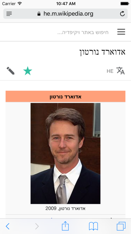
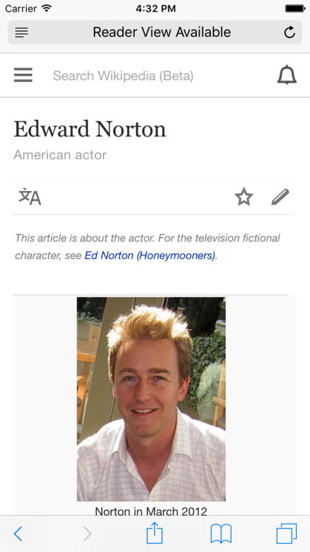
[edit]Description: We would also like to align article actions into a concise toolbar under the title of the article. These are actions that can be taken on an article.
Three actions
- Change language
- Add to watchlist
- Edit the article
- View on mobile device
-
Sample right to left page without Wikidata description
Known Pros:
- Easy to implement
- Provides easy access to changing language without scrolling
- Aligns article actions in a better way than what we have
Known Cons:
- User has to scroll to the top to change the language in the middle of the article
- Might be coming in the way of casual, monolingual reader [#] (because it pushes start of the article further down the screen??)
Votes
[edit]| Vote | Comments |
|---|---|
| I like this - it makes the language switching visible alongside highlighting editing ability. ISO codes can be confusing though. | |
| Très pratique, également. Tyseria (talk) 12:48, 24 February 2016 (UTC) | |
| looking great. Mikey641 (talk) 15:25, 24 February 2016 (UTC) | |
| It's simple and easy to use. BSitzmann (WMF) (talk) 19:00, 23 February 2016 (UTC) | |
| I like the fact that the language code is compact and although the full language name may be preferable it's not essential. It's easy to learn, provided when clicking it more information on what that language code means is given. All the button needs to do is make clear it is a button, the language should be clear. The purpose of the button is not to tell you what language you are using... so why waste prime real estate with that information that could be used for say a talk button? This is my preferred solution. Jdlrobson (talk) 23:05, 24 February 2016 (UTC) | |
| Good, but not quite as optimal as the third option. There's no reason not to state the full name of the language (instead of the ISO code) when there's enough space for it. DBrant (WMF) (talk) 13:16, 24 February 2016 (UTC) | |
| Not sticky, and uses a code rather than a name. Amir E. Aharoni (talk) 13:35, 24 February 2016 (UTC) | |
| Per what DBrant said. --ESM (talk) 17:37, 24 February 2016 (UTC) | |
| A nice option. בנימין (talk) 16:52, 27 February 2016 (UTC) | |
| I like this, it looks good and not distracting. --Ziad (talk) 13:46, 29 February 2016 (UTC) |
Solution 3: Top of the article with different treatment
[edit]Description: This is same as Solution 2 but [#] to tackle the one of the Cons from Solution 2, we can try a different treatment.
- A different background for article bar
Votes
[edit]| Vote | Comments |
|---|---|
| I like that this highlights editing as well. Full language text will also be less confusing for our readers who are not so immersed in ISO language codes. | |
| I like this even better than option 2 since it has a different background for the (action) bar. This is similar to what is done in the Android app. BSitzmann (WMF) (talk) 19:00, 23 February 2016 (UTC) | |
| I like this treatment the most. It gently highlights the options of editing and starring, adds language selection in line with the other options (not needing extra vertical space), and states the actual language used, instead of the ISO code. DBrant (WMF) (talk) 13:11, 24 February 2016 (UTC) | |
| There is a challenge for languages of long names overlapping watch star and edit. This makes the language switching tool more prominent without interfering with the reading experience. I'm not sure what the benefit of the full language name in the button is, given that upon clicking the button that information would be available and the primary purpose of this button is to be clicked (Note I'm yet to see a sticky footer on mobile that has been done well but that aside I think the sticky footer is not merited for 2 actions which occur on less than 5% of page views ). Jdlrobson (talk) 22:59, 24 February 2016 (UTC) | |
| It's better than #2 simply because it uses the whole language name. I still prefer #1, however, because it's sticky. Amir E. Aharoni (talk) 13:35, 24 February 2016 (UTC) | |
| Ah, non. C'est beaucoup trop gros et moche. Tyseria (talk) 12:49, 24 February 2016 (UTC) | |
| there's just something about it that i don't love.Mikey641 (talk) 15:27, 24 February 2016 (UTC) | |
| Per what DBrant said. --ESM (talk) 17:38, 24 February 2016 (UTC) | |
| I prefer this option. I think it will be less confusing for the readers. --Yuanga (talk) 21:40, 24 February 2016 (UTC) | |
| I don't like the grey background. בנימין (talk) 16:52, 27 February 2016 (UTC) | |
| I find it distracting by this gray colored box. Although I'm neutral with using full language name or ISO code. --Ziad (talk) 13:49, 29 February 2016 (UTC) |
Final Design Based on Feedback
[edit]Thanks to everyone who gave feedback on the initial treatments for improved language switching on mobile web.
We reviewed the feedback given in the above section and synthesized it. The outcome was that it seemed the top of the article without the gray background was preferred. In addition, it was pointed out that users already know what language they are reading and writing out the full language name would take up valuable space on every single page. It was also pointed out that most users are not familiar with ISO language abbreviations, so we decided to stick with the button. After all, it is no more confusing than "star = watchlist".
Here is the final design, pending any unforeseen circumstances or challenges:
- Design showing language switching button at the top of the article on mobile web
Any updates will made here: https://phabricator.wikimedia.org/T128350
Pre-implementation analysis
[edit]Refer to the following for some pre-implementation analysis.
T125127 [Release] Confirm language overlay sampling on production working as expected
On 12-February-2016 before changes to the language switcher modal or introduction of a new button placement, the data on the stable channel suggested that globally the "Read in another language" button was tapped about 1.3% of the time when there was an impression of it. This was heavily influenced by enwiki traffic, where the preponderance of traffic existed at the time. A few examples where the button impression sample size exceeded the magical 30 number: On arwiki tapthrough was about 2.5%, hewiki it was about 3.1%, jawiki 0.5%, and eswiki about 0.8%. This was based on the following queries.
select t1.event_event, count(*)
from MobileWebLanguageSwitcher_15302503 t1
inner join
MobileWebLanguageSwitcher_15302503 t2 on t1.event_funnelToken = t2.event_FunnelToken
where t2.event_mobileMode = 'stable' and t2.event_event = 'languageButtonImpression' and t1.event_event in ('languageButtonImpression', 'languageButtonTap') group by t1.event_event, t1.event_exitModal, t1.event_searchInputHasQuery;
Analysis on one week with new overlay in stable channel
[edit]The new overlay has been released into the stable channel on the mobile web. A comparison of one week of data with the new overlay fully rolled out versus the previous overlay (looking at a week window two weeks prior) is promising.
New overlay base data
[edit]The following query helps to produce "Read in another language" button usage, which is as of 8-April-2016 what's in the stable channel for mobile web users (this is the existing old approach, a new affordance is being tested in beta at this time).
select t2.event_funnelToken token, t2.event_mobileMode, t2.webHost host, t2.event_languageCount langc_listload, t2.event_languageOverlayVersion oversion, t1.event_primaryLanguageOfUser priulang, t1.event_languageButtonTappedBucket tapbucket, t0.userAgent ua
from
MobileWebLanguageSwitcher_15302503 t2
inner join
MobileWebLanguageSwitcher_15302503 t1 on t2.event_FunnelToken = t1.event_FunnelToken
inner join
MobileWebLanguageSwitcher_15302503 t0 on t1.event_FunnelToken = t0.event_FunnelToken
where
t2.timestamp > '2016033122' and t2.timestamp < '2016040722' and t2.event_event = 'languageListLoaded'
and t1.timestamp > '2016033122' and t1.event_event = 'languageButtonTap'
and t0.timestamp > '2016033122' and t0.event_event = 'pageLoaded' and t0.event_beaconCapable = 1;
The following produces tapthrough events from within the overlay.
select t3.event_funnelToken token, t3.event_mobileMode, t3.webHost host, t3.timestamp ts_exit, t3.event_languageTapped destlang, t3.event_positionOfLanguageTapped tappos, t3.event_languageCount langc_exit, t3.event_exitModal evt, t3.event_searchInputHasQuery issearch, t2.timestamp ts_listloaded, t2.event_languageCount langc_listload, t2.event_languageOverlayVersion oversion, t1.timestamp ts_langbuttontap, t1.event_primaryLanguageOfUser priulang, t1.event_languageButtonTappedBucket tapbucket, t0.timestamp ts_pageload, t0.userAgent ua
from MobileWebLanguageSwitcher_15302503 t3
inner join
MobileWebLanguageSwitcher_15302503 t2 on t3.event_FunnelToken = t2.event_FunnelToken
inner join
MobileWebLanguageSwitcher_15302503 t1 on t2.event_FunnelToken = t1.event_FunnelToken
inner join
MobileWebLanguageSwitcher_15302503 t0 on t1.event_FunnelToken = t0.event_FunnelToken
where
t3.timestamp > '2016033122' and t3.event_event = 'exitModal'
and t2.timestamp > '2016033122' and t2.timestamp < '2016040722' and t2.event_event = 'languageListLoaded'
and t1.timestamp > '2016033122' and t1.event_event = 'languageButtonTap'
and t0.timestamp > '2016033122' and t0.event_event = 'pageLoaded' and t0.event_beaconCapable = 1;
New overlay interaction
[edit]The following produces a count of "Read in another language" events tied to the new overlay using the data from the first query's output.
$ cut -f1-7 new_init.csv | sort -u > new_deduped_init.csv
$ cat new_deduped_init.csv | grep stable | grep 'structured-o' | wc -l
 2020
The following produces a count of language selections from within the new overlay using the data from the second query's output.
$ cut -f1-3,5-9,11-12,14-15 new_tap.csv | sort -u > new_deduped_tap.csv
$ cat new_deduped_tap.csv | grep stable | grep 'structured-o' | grep 'tapped-o' | wc -l
 1348
In other words, there was about a 66.7% language selection rate with the new version based on a week of data.
The following represents the number of dismissals.
$ cat new_deduped_tap.csv | grep stable | grep 'structured-o' | grep 'dismissed' | wc -l
 86
The dismissal rate with the new overlay was about 4.26%.
Old overlay base data
[edit]Here are the queries for looking at the language overlay with the old modal two weeks prior (one week prior should not be used, ironically, due to some translation issues associated with a late breaking code revert; these issues did not impact the new overlay, incidentally).
"Read in another language" button events:
select t2.event_funnelToken token, t2.event_mobileMode, t2.webHost host, t2.event_languageCount langc_listload, t2.event_languageOverlayVersion oversion, t1.event_primaryLanguageOfUser priulang, t1.event_languageButtonTappedBucket tapbucket, t0.userAgent ua
from
MobileWebLanguageSwitcher_15302503 t2
inner join
MobileWebLanguageSwitcher_15302503 t1 on t2.event_FunnelToken = t1.event_FunnelToken
inner join
MobileWebLanguageSwitcher_15302503 t0 on t1.event_FunnelToken = t0.event_FunnelToken
where
t2.timestamp > '2016031722' and t2.timestamp < '2016032422' and t2.event_event = 'languageListLoaded'
and t1.timestamp > '2016031722' and t1.event_event = 'languageButtonTap'
and t0.timestamp > '2016031722' and t0.event_event = 'pageLoaded' and t0.event_beaconCapable = 1;
Tapthrough events from within the old overlay:
select t3.event_funnelToken token, t3.event_mobileMode, t3.webHost host, t3.timestamp ts_exit, t3.event_languageTapped destlang, t3.event_positionOfLanguageTapped tappos, t3.event_languageCount langc_exit, t3.event_exitModal evt, t3.event_searchInputHasQuery issearch, t2.timestamp ts_listloaded, t2.event_languageCount langc_listload, t2.event_languageOverlayVersion oversion, t1.timestamp ts_langbuttontap, t1.event_primaryLanguageOfUser priulang, t1.event_languageButtonTappedBucket tapbucket, t0.timestamp ts_pageload, t0.userAgent ua
from MobileWebLanguageSwitcher_15302503 t3
inner join
MobileWebLanguageSwitcher_15302503 t2 on t3.event_FunnelToken = t2.event_FunnelToken
inner join
MobileWebLanguageSwitcher_15302503 t1 on t2.event_FunnelToken = t1.event_FunnelToken
inner join
MobileWebLanguageSwitcher_15302503 t0 on t1.event_FunnelToken = t0.event_FunnelToken
where
t3.timestamp > '2016031722' and t3.event_event = 'exitModal'
and t2.timestamp > '2016031722' and t2.timestamp < '2016032422' and t2.event_event = 'languageListLoaded'
and t1.timestamp > '2016031722' and t1.event_event = 'languageButtonTap'
and t0.timestamp > '2016031722' and t0.event_event = 'pageLoaded' and t0.event_beaconCapable = 1;
Old overlay interaction
[edit]The following produces a deduplicated count of "Read in another language" events tied to the old overlay using the first query's output.
$ cut -f1-7 mid_init.csv | sort -u > mid_deduped_init.csv
$ cat mid_deduped_init.csv | grep stable | grep 'simpler-o' | wc -l
878
Notice the number is lower than for the corresponding count of initiations of the new overlay. That's because there was an A/B test of the new versus the old going on at this time. As a side note, we decided based on the A/B testing at that time to update our language sorting mechanism in the new overlay in part to be similar to the old overlay, while keeping the new look and feel and keeping a keyboard language heuristic we implemented in the new overlay.
And here's the tapthrough count.
$ cut -f1-3,5-9,11-12,14-15 mid_tap.csv | sort -u > mid_deduped_tap.csv
$ cat mid_deduped_tap.csv | grep stable | grep 'simpler-o' | grep 'tapped-o' | wc -l
 578
In other words, there was about a 65.8% language selection rate with the old version based on a week of data.
The following represents the number of dismissals.
$ cat mid_deduped_tap.csv | grep stable | grep 'simpler-o' | grep 'dismissed' | wc -l
51
The dismissal rate with the old overlay for this observation period was about 5.81%.
Analysis
[edit]One feature of the new language overlay is use of a keyboard language detection heuristic that floats the user's keyboard language option to the top of the screen, with the hope that users can scroll less and can also see the translated term for the title of the page at a glance. Although the latter case of term lookup should tend to reduce the tapthrough rate, the tapthrough rate appeared to hold up relatively well with the new overlay, in this case outperforming the old overlay for the observed windows of comparison. Additionally, dismissal rates were relatively lower with the new overlay compared to the old overlay for the observed windows. We anticipate fluctuation in these numbers as with any natural system, and a period of adjustment to the new overlay (e.g., for users who have cleared their browser history and are effectively first time users of the new overlay).
As hypothesized, first time usage of the overlay suggested that keyboard language detection, although imperfect (sometimes there is no corresponding translated title, sometimes the keyboard language is a poor indicator of the user's preferred language, and so on), appeared to improve the user experience for users who tapped through to select an alternative language.
cat new_deduped_tap.csv | grep stable | grep 'structured-o' | grep 'tapped-o' | grep '0 taps' | cut -f5 | sort -n
cat mid_deduped_tap.csv | grep stable | grep 'simpler-o' | grep 'tapped-o' | grep '0 taps' | cut -f5 | sort -n
The average position for the new overlay was about 6.90 whereas the average position for the old overlay was about 8.88, representing about 22.4% less scrolling. As a point of reference at the 80th percentile the language tap position with the new overlay was 8 whereas it was 12 with the old overlay.
Given these encouraging signals, the next step should be, pending user research analysis, to roll out the updated language switcher affordance, which presently is a new icon in the beta channel at the top of articles (as opposed to a text labeled button at the bottom of articles).


