Reading/Multimedia/Media Viewer Archive 2013
This page is obsolete. It is being retained for archival purposes. It may document extensions or features that are obsolete and/or no longer supported. Do not rely on the information here being up-to-date. |

Here are our proposed feature requirements for future versions of the Media Viewer, a new tool under development by the Wikimedia Foundation's new multimedia team. This tool aims to improve the multimedia viewing experience, to address issues outlined in this planning page.

For information about the first release version of the Media Viewer, please check this page. We invite comments from community members on this discussion page.
See more user feedback from this first multimedia roundtable, this IRC chat and this third multimedia roundtable, held at Wikimania on August 8th in Hong Kong.
Goals
[edit]

Purpose
[edit]The purpose of this tool is to:
- Provide a richer multimedia experience, to match user expectations
- Display images in larger size, on the same page as the thumbnail you click on
- Reduce confusion when users click on thumbnails (bypass duplicate file info page)
- Offer new ways for viewers to take action (e.g. feedback or tags - future versions)
It aims to serve all users of Wikipedia, Commons and other MediaWiki sites (including 500M ‘readers/viewers’, but also active and very active editors).
Note that this media viewer would initially only be for still images, as we are now using the Kaltura video player for audio and video. But over time, we would like to use the same UI across players, and eventually use a single viewer for all file formats.
Minimum Viable Product
[edit]Features for our first minimum viable product include:
- Show images in larger, media viewer panel when you click on them
- Modal panel opens up as overlay (on same page where you clicked)
- Large image appears without clutter (lightbox view)
- Information about the image can be accessed easily (in lightbox view)
- Image can be shown in full-screen mode (full screen view)
Workflows
[edit]The thumbnails to the right show the reader workflows we are looking to support:
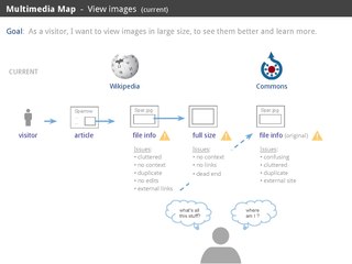
- Current workflow for viewing images (shown above for reference)
- Proposed workflow for viewing images with Media Viewer
- Overview of reader workflows
Lightbox View
[edit]The 'lightbox view' for this tool will shows a large image in a dark lightbox that extends across the browser window, as well as information in three tiers and related images, as proposed below.
Image
[edit]The image should be shown in larger size, as an overlay over the page where the user clicked on the thumbnail, against a dark, slightly translucent background. The intent is to makes the image pop up and remove some of the visual clutter typically found on a text article page. The image should be shown at the highest possible size and resolution for the user's current screen and browser.
In the image view, the browser window will be darkened, but not the entire screen (unlike the Full-screen view where the entire screen will be darkened).
Primary Info
[edit]Here are the most important information fields that need to be shown prominently right below the image, as requested by our community (see attached wireframe):
- File name (Zonotrichia atricapilla.jpg)
- Author (e.g. Alejandro Erickson)
- Source (e.g. Bird Institute)
- Uploader name (e.g. Smallbones)
- License (e.g. CC-BY-SA-2.0)
- Permissions (if any, for images with restricted rights)
- Site name (e.g. Wikimedia Commons, with logo icon and explicit link to the file info page)
- Date (e.g. 12 April, 2012)
This mockup detail shows one way this important information could be presented to the user, to minimize clutter near the image, but still keep important information as prominent as possible.
Here is another possible way that we could display these important fields, right below the image:
Zonotrichia atricapilla.jpg By Alejandro Erickson - Bird Institute - CC-BY-SA-2.0 (see rights) Posted on <Wikimedia Commons> by <Smallbones> on 12 April, 2012
Secondary Info
[edit]Here is the next tier of additional information fields that can be shown below the primary information (with a smaller font):
- Special credit (e.g. Featured picture in Wiki Loves Monuments 2013 or required GLAM credit)
- Description (e.g. A Golden-crowned sparrow in British Columbia, Zonotrichia atricapilla … more> )
- Categories (e.g. Birds of British Columbia, Zonotrichia atricapilla … more> )
- File format / size (e.g. JPEG, 4928 x 3264 px (more), 3.8 Mb)
- Tool used for upload (e.g. 'Via Flickr')
- Location (e.g. place name and/or geotag coordinates, if any)
Details
[edit]A third tier of details that can be shown below the secondary information, but with an even smaller font (though not so small that you have to squint to read it). This would include some of the Exif data, such as camera, lens, focal length, shutter speed, aperture, ISO, etc. This could also be a good place to show curation categories and keywords, once we start implementing tags next year. I would also suggest that we add some of the other articles that are using this image, with a link to see more.
Tools
[edit]For the first release, we are looking to provide these simple tools:
- Close button (goes back to article view)
- Full screen button (expands into full-screen view)
- Lightbox button (returns to smaller image in browser lightbox)
In future releases, we are looking to provide more tools:
- Next/previous arrows (step through related files)
- Share (with friends on your social networks)
- Thanks (thank the user who uploaded this file)
- Add (insert this file in an article, or into a gallery)
- Flag (report any issues with this file)
These future tools would be shown next to the image, as proposed in this mockup detail, for discussion purposes.
They can be grouped into a toolbar that would appear on mouseover above the image, as proposed in this mockup.
Other media
[edit]In future releases, we would like to show thumbnails of other media files, to invite users to browse related media.
These would be shown in different groups:
- More (other media files in this article or gallery)
- Related (files that share the same categories or tags)
- Nearby (files that are located nearby, based on geotags)
These groups would be featured below the image and its info, and be shown as rows of small thumbnails.
Each row will only display up to 4-5 images at a time, and a 'More' link would be provided to let users see more.
Clicking on a thumbnail would display that image in the same Media Viewer.
We will aim to develop these features incrementally after the first release, based on feasibility and desirability.
Full-screen View
[edit]
The 'full-screen view' for this tool will shows a large image across the entire screen, with minimal information and buttons available on hover, as proposed below.
This is the view that lets you focus exclusively on the image, with no other distractions.
Full image
[edit]When you click on the full screen icon, you would see the largest version of the image that fits within the user's screen. The image would be displayed across the entire screen (not just the browser window), set against a pure black background color that only shows the image (instead of a translucent background that reveals the page below).
Information
[edit]You would see the file name and the author/source/license below the image, as well as link to Commons.
Note that we would never make that info overlap the image, even in full screen, because it could obscure important map or diagram labels; so we may want to consider a black section at the bottom of the screen for that information, as proposed in the full screen mockup below.
If desired by users, it may be possible to include more information below the image, available by scrolling down. But to reduce clutter, that info would only need to appear when they hover over the bottom of the screen.
Toolbar
[edit]A toolbar would be shown on mouseover at the top of the screen, to reveal the same tools proposed for the lightbox view, as proposed in this mockup..
Next releases
[edit]
Wishlist for second version
[edit]For the next version in fall 2013, we are considering these features:
- Next/previous arrows (step through related files in same gallery/category)
- Related files button (show thumbnails of files in same gallery/category)
- Discussion button (goes to Commons talk page)
- Edit button? (goes to Commons edit page)
- Category button (for adding categories for this file on Commons)
- Slideshow button (very simple slideshow mode initially, no music, just images)
Wishlist for future versions
[edit]For future releases, we are considering these features:
- thanks (send notification to uploader to show appreciation, through notifications)
- flag (reports this file as inappropriate on Commons)
- tag (tag this file with a new category, geolocation or intersecting tags)
- add (insert this file in an article, or into a gallery)
- share (share this file on FB, TW and other networks)
These tools would help users take action on the media they are viewing. For example, a user might want to add a file to their watchlist, or thank the person who uploaded the file, flag a file as inappropriate, tag it with a new category, add this file to an article or share it on social networks, etc. These tools could be offered in a toolbar above or below the image, with a few icons for tools such as Watch, Thank, Flag, Tag, Add, or Share.
Some of these tools would require modal displays of user options when you click on them, so it might also be worth it to think of the default 'Info' view as the first tab in the toolbar, which could be replaced by a different view if you click on another tool. For example, clicking on 'Tag' could display a couple text fields, one for categories, another for geo coordinates, and eventually one for intersecting tags.
Although we will not be able to implement these tools in the first release in September, we would like to develop some of them incrementally in the coming year. So it makes sense for us to start a design exploration of where these tools would appear in the Media Viewer, and take that in account in our first design, so we don't have to redesign everything from scratch when we are ready to start adding these tools in coming months.
Mockups
[edit]Here are larger versions of the latest mockups from our design team, for discussion purposes.
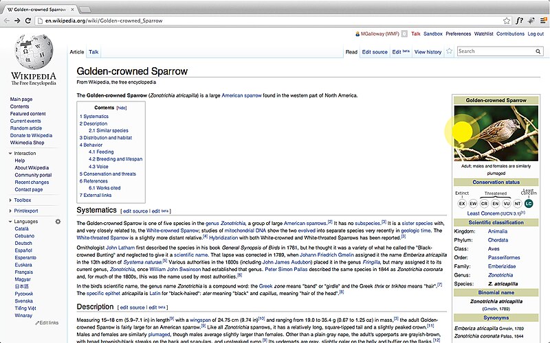
Article View
[edit]
Lightbox View
[edit]
Show Toolbar on mouseover
Full-screen View
[edit]
Show Toolbar on mouseover
See earlier mockups on this MediaWiki draft page.
Code
[edit]We are now in early stages of development on this feature and the current alpha is not yet ready for testing.
Our work in progress can be viewed here (Gerrit 78341).
See also:
- Prototype:[1], source at [2], depends on gerrit:72844. --by MarkTraceur (talk)


