Mobile design/Beta opt-in
This page is obsolete. It is being retained for archival purposes. It may document extensions or features that are obsolete and/or no longer supported. Do not rely on the information here being up-to-date. See Reading/Web/Mobile Beta for more up-to-date information |
This document is a work in progress. Comments are appreciated but this is not a final draft.


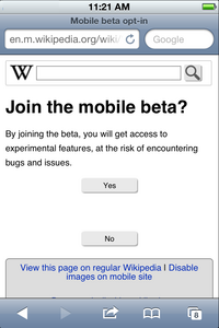
This document describes the design of a beta notification and opt-in for the developing Wikipedia Mobile site.
Rationale
[edit]There is currently no notification, or way to opt-in and out, of the beta version of the mobile site.
To address Bugzilla 34232
Goals
[edit]- To notify Wikipedia mobile users of the beta site
- To allow users to easily opt in and out of the beta
- To have minimal user experience interruption in doing so
- To minimize the steps to achieve this
Notification behavior
[edit]Not needed at this time.
Access to the beta
[edit]There will only be a button in the footer of the page. The user will select the button and the page will refresh with new text indicating that they are now seeing the beta site. The button will allow them to return to the original site in the same way.
A link will be added to the footer with information about the beta.
An opt-in/out button is added to the gray menu box that exists at the bottom of each page.
- OPT IN
- This includes,
- a typical-sized line of text
- "Wikipedia Mobile is getting better."
- a small gray button with blue text
- "Try it now"
- "Show Me"
- OPT OUT
- This includes,
- a typical-sized line of text
- "This Mobile site is in development."
- a small gray button with blue text
- "Go back"
- "Original"
Tangential questions
[edit]What if the user has an issue with the beta? Something broken, etc.
Language considerations
[edit]- "Beta"
- The typical user may not understand the term 'beta' (software jargon) and we should find other language to explain our intentions.
- "Experimental" was not used due to sounding 'shady', like something bad might happen.
- "Sign up" was not used because it indicates another step of "signing up" which does not exist.
- "Testing" might sound scary and there may be nothing to test.
- "Wikipedia is working on a new mobile site! Would you like to test it?"
- "Helping" sounds friendly, but there may be nothing to help with.
- "Would you like to help us with our new beta mobile site?"
- Possible ESL issues
- Opt-in and opt-out, may not be clear, perhaps to "see" or to "try" are more basic.
Meeting Notes
[edit]February 9, 2012
[edit]- A question was asked whether everyone would get notification, and it was decided that notification is not necessary at this time.
- There will only be a button in the footer of the page. The user will select the button and the page will refresh with new text indicating that they are now seeing the beta site. The button will allow them to return to the original site in the same way.
- A link will be added to the footer with information about the beta.
- Some indication that the user is seeing the beta site will be designed. This may include a new W integrated with the word beta, or a row of the word beta above the search box.
- There is an open issue regarding user feedback of the beta site.


