Manual:Mobiles, tablets and responsive design

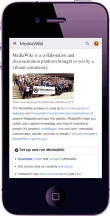
MediaWiki will work on many mobile devices (ie. smartphones and tablets), but it is not optimized for mobile devices. Unless you add additional skins or extensions, this means that sites may be difficult to view, with menus, layouts and media, not appearing in the best place.
Except for the skin Timeless, none of the skins bundled with MediaWiki, including the latest default skin, Vector, are optimized for use with mobiles. This page provides advice for using MediaWiki on mobile devices, such as smartphones and tablets.
Solutions
[edit]There are two common approaches:
- Skin:Timeless is already bundled with MediaWiki. Make sure it is registered in LocalSettings.php so it is available as a setting in preferences. Consider using it as the default.
- Skin:Minerva Neue is bundled with MediaWiki since version 1.38. Its mobile mode requires installing Extension:MobileFrontend. This is the method Wikipedia uses.
Extensions
[edit]- Extension:MobileApp - Simple app that serves styles and scripts for use in the Wikimedia mobile applications
- Extension:MobileFrontend - Provides a mobile-friendly view. Developed by Wikimedia, and used on Wikipedia. Installing only this extension by itself, will make your MediaWiki site mobile-friendly, and it includes its own skin.
Skins
[edit]You do not require an extension if you use a skin. Skins for use with mobile browsers come in two forms:
- Those designed specifically for use with a mobile, and may not view well on non-mobile devices. MediaWiki detects the kind of device on which it is running, and then switches to the appropriate skin. (See Extension:MobileDetect)
- WPtouch - A skin which formats your wiki with a mobile theme
- Responsive skins, which are designed to respond automatically to the size of the screen, regardless of whether it is a desktop PC, tablet or smartphone.
CSS & JS
[edit]When using Extension:MobileFrontend, you can edit the wiki pages MediaWiki:Mobile.css (see Manual:CSS) and MediaWiki:Mobile.js for global styles and scripts to be applied only on mobile.
Developers
[edit]See also: Making MediaWiki Mobile Friendly
- Category:Mobile - Projects, extensions and other pages related to Mobile device development and presentation.
- Reading/Web - responsible for creating, growing, and evolving how the diverse set of Wikimedia projects use mobile technologies
- Manual:$wgResponsiveImages (MW 1.21+) - Whether or not to output high-resolution images for high-DPI displays.
- Extension:MobileDetect (MW 1.15+) - allows users to control which content is displayed only in mobile browsers, or only on desktops
- Category:Mobile skins - Skins for mobile devices
