Glaucus
This page is obsolete. It is being retained for archival purposes. It may document extensions or features that are obsolete and/or no longer supported. Do not rely on the information here being up-to-date. |


- In Greek and Roman mythology, Glaucus (Glaukos, "glaring (eyes)"; compare Greek glaux, owl, of the same origin) is the symbolic owl of Athena or Minerva, respectively.
This document describes the design of a mobile-focused skin and interaction system intended to be deployed to the Wikipedia mobile gateway. It is intended to serve as the first step towards a greater rethinking of the interface, codenamed Athena.
Glaucus is not intended to solve several major interaction problems that exist within Wikipedia itself. Instead, it is intended provide a framework for further addition of features and links in a sane manner.
This document is a work in progress. Screen mockups are approximate at this time. Feedback is appreciated on the talk page.
Rationale
[edit]Currently, Wikipedia's mobile gateway is not designed to handle additional features well. New features are being developed all the time, and there is no obvious way to include them into the interface.
Goals
[edit]- To organize various features of the mobile site in such a manner as to:
- Be intuitively navigable
- Allow for growth
- Provide a modern visual refresh
- Serve as an intermediate step within the greater vision for the mobile and desktop platform
Feature Categorization
[edit]Broadly, features for mobile have been categorized into the following areas:
- Site Specific - functionality and navigation that is relative to Wikipedia as a whole
- Article Specific - functionality relative to the article being viewed
- User Account Related - functionality specific to the user in question
- Contributary - functionality related to contributing to the project (such as image uploads or curation tools)
- Search - functionality related to searching the encyclopedia
A special case is made for inter-wiki language links. This feature is of extreme importance to readers (70%+ of whom are multi-lingual). While these links are article-related, hiding them behind a menu is not desirable, as there is no easy way to explain to a reader that they can change their language if they do not understand the language the site is currently being presented in.
Interface Behavior
[edit]Top Bar
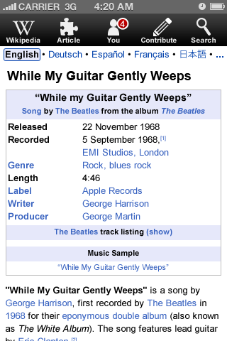
[edit]A primary component to the Glaucus interface is the "top bar". This area is designed to be an obvious series of menus that the user may interact with.
The buttons on the top bar align closely with the previous described feature categories, though their labels may not.
During early iterations of development, not all buttons will be included. For example, contributions are unlikely to appear with the first launch.
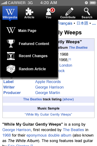
With one exception, tapping on any of the buttons will activate a category-specific menu that will overlay the screen ("Search" is the exception; see below for its behavior).
The five designed menu buttons are:
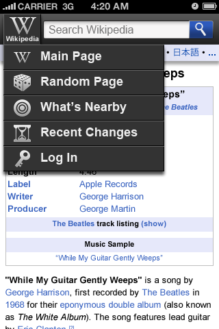
- Wikipedia
- Article
- You / Log In
- Contribute
- Search
In the case of the "You/Log In" button, the button will be "Log In" if the user has not logged in and will change to the user menu if they have.
Behavior
[edit]Upon first load of the site, the top bar (and inter-wiki links) will be visible and remain visible, always. The top bar should be fixed positioned.
An alternative behavior is to have the top bar scroll off the screen as the user scrolls, but then appear immediately if the user taps the screen.
This interaction behavior should be tested.
Button Layout
[edit]The two primary buttons, Wikipedia and Search, are to be set flush left and right, respectively. Additional buttons are to be evenly spaced within the top bar.
Top-Bar Menus
[edit]Wikipedia
[edit]- Main Page - links to the main page.
- Featured Content - links to the featured content portal.
- Recent Changes - links to the recent changes feed (disable?)
- Random Article - links to Special:Random
Article
[edit]- History - links to the article's history page.
- Discussion - links to the article's discussion page.
- What Links Here - links to "what links here" for the article.
NOTE: This menu perpetuates a poor interaction within Wikipedia, which is the conflation that there are not also histories to discussions and so forth. Solving the greater Wikipedia "tab/sub-tab" interaction is currently outside of the scope of this feature.
Personal
[edit]- User Page Link - links to the user's user page.
- Your Notifications - This feature is dependant upon the development of an notification system.
- Your Talk Page - links to the user's talk page.
- Your Watchlist - links to the user's watchlist.
- Your Contributions - links to the user's contributions list.
- Your Preferences - links to the user's preferences setting form.
- Log Out - This option is given extra vertical spacing.
Contribute
[edit]The contents of this menu are currently to be determined.
Inter-wiki Language Links
[edit]The inter-wiki language links bar is docked to the top bar. It will have a different background color designed to better connect it to the article content.
If the top bar is fixed, then the inter-wiki links should undock from the top bar as the user scrolls (thus scrolling off the screen). If the top bar is not fixed, then the inter-wiki links should appear along with the top bar.
The entire link bar is "hot". Clicking anywhere on it will bring up the simple language picker.
The choice of which languages to show in the language bar is up for discussion. Regardless of the order, at least one language should utilize non-Roman glyphs.
Search Button Behavior
[edit]Clicking on the "Search" button will replace the entire screen with the new "full screen" search results functionality. The top bar will disappear as the search system overlays the entire screen.
Minimal Mobile Interface
[edit]- This is a gallery of a minimal version of the mobile interface. Imagining a step between the existing UI and Glaucus.
-
Simplified header/search Option 1.
-
Option 2.
-
Option 3, no icons.
-
Simplified article.
-
Simplified article, sections expanded.
-
Simplified footer
-
Simplified footer, more information.
Minimal header revisions
[edit]- Indicating the search field and imagining an expanding menu.
-
Minimal header with visible search field (surface box).
-
Minimal header with visible search field box and drop menu.
-
Minimal header with visible search field (cut-out box).
-
Minimal header with visible search field cut-out box and drop menu.
-
W button alternatives
Minimal contact/feedback page
[edit]This gallery includes yet another version of the simplified header.
Any other buttons and boxes used in this interaction should match the header.
-
Contact us landing page (with minimal header).
-
Contact us landing page, footer collapsed.
-
Contact us feedback page category menu expanded.
-
Contact us feedback page category selected.
-
Contact us feedback page email and feedback entered, scrollbar allows for longer comments.
-
Contact us landing page after a comment is sent.


