Visual-based mobile editing/Ideas/October 2018
The Editing team is looking at the mobile editing experience. They have investigated the state of the visual editor on the mobile site and identified multiple pain points. The next decision is to decide which problems to fix first. This page lists seven ideas for improving the visual editing experience on the mobile site.
How to help:
We want to hear from you! Please look at these ideas, and tell us what you think about them.
Go to the talk page, and put your subject title in the box that says "Start a new topic". You can write in any language on this wiki.
Section editing
[edit]
The visual editor normally opens the whole page for editing. When you are focused on a single section, you might prefer section editing. Section editing can help you focus on the portion you intend to change.
See: phab:50429, phab:T86265
Toolbar improvements
[edit]
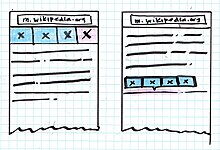
Improving the toolbar on the mobile site could make it easier for you to accomplish your editing goals. The toolbar needs to include the right options and have an easily accessible design.
See: phab:113638
Remember my scroll position
[edit]
This idea is to preserve what's called the "scroll depth" when you switch between editing modes. Right now, when you switch from wikitext editing to the visual editor, you have to save your edit and start over at the top of the page – not right where you were editing. It would be easier for editors if the cursor stayed in the same part of the article, so you could continue with your work.
See: phab:T128422
Table of contents
[edit]
Navigating through long articles can require a lot of scrolling. Instead, you could use a table of contents to move to your desired position quickly.
Differentiating modes with UI
[edit]
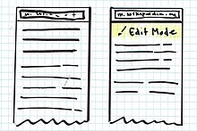
Sometimes it's hard to figure out whether a page is being read or is open for editing. It might be less confusing to have visibly separate modes for reading, formatting, and publishing your changes.
Figure out whether you're done
[edit]
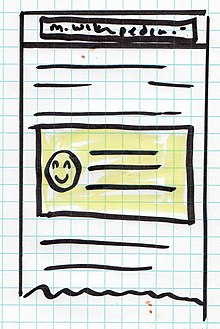
It's not always clear whether you've finished a workflow. Do you need to do something else before you close that dialog box? Do you need to click something else to publish your changes, or did it happen automatically? It might be less confusing if we added colors, icons, or other indicators that show where you are in a task's workflow.
Improve copying and pasting
[edit]
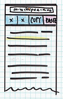
Editors frequently need to copy and paste to move text or focusable nodes (such as references or images). This isn't always easy. We could make it easier by implementing recognizable tools for these common tasks.
See: phab:T204239, phab:T101113
Do you have another idea?
[edit]If you have another idea, please share it with the Editing team. You can describe your idea on the talk page.
