MediaWiki/Homepage redesign/Design Document
This page is obsolete. It is being retained for archival purposes. It may document extensions or features that are obsolete and/or no longer supported. Do not rely on the information here being up-to-date. |
| MediaWiki Homepage Redesign |
|---|
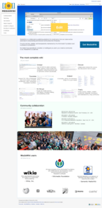
This project intends to redesign the mediawiki.org homepage to better promote MediaWiki as a product and as a free software project. The goal is to deliver a proposal of an alternative homepage, including final content and design, developed with the participation of the community.
This exercise supersedes Requests for comment/MediaWiki.org Main Page tweaks, which will be deprecated.
Rationale
[edit]The mediawiki.org homepage should help visitors adopting MediaWiki, support current users, and invite new contributors to get involved. The current homepage tries to accomplish all this, but it is hampered by an outdated look & feel, spaces that could be used better, plain descriptive texts, and a large quantity of links. The homepage leaves major questions unanswered, starting with "Why should I use MediaWiki?". Wikipedia, MediaWiki's greatest success, is barely mentioned, and other big MediaWiki users are missing.
Since 2012, the community has discussed about current layout of the homepage. Solving these problems requires a general plan, a coordinated action, described in this design document.
Questions
[edit]These are the questions that we expect to be answered by the mediawiki.org homepage.
New adopters
[edit]- What is MediaWiki?
- What problem it solves?
- No answer to this question. The homepage could show how MediaWiki is ideal for collaborative editing and creation of content.
- Who uses it?
- The homepage cites Wikipedia, itself and has a link to view a list of more sites that use it. Perhaps a visual reference could be more efficient and attractive, see for instance: Git.
- How can I get it?
- Currently, the homepage has just link and button to download without emphasizing how to get it. The Firefox site has a good example order to emphasize the download button.
- Why would I want to use it?
- No answer to this question. To answer this question is necessary show the benefits and advantages of MediaWiki over other wiki softwares.
- Why we appreciate MediaWiki?
- On the homepage has no references about why we liked and enjoyed MediaWiki. Could have some space reserved for it, see for instance: GitHub.
Current users
[edit]- How can I use it?
- On the homepage has many links to pages that help answer this question, but it could be better grouped, more directed and organized. See for instance: OpenOffice.
- How can I customize and extend MediaWiki?
- The homepage has links to how add features with third-party extensions and how write extensions. Besides the links the homepage could have some text to tell more about customize and extending, see for instance: AngularJS.
- Where can I get help?
- The homepage has links to communicate page, support desk and help. In addition contains links to help directed to each type of user (user/sysadmin/developer). To improve it could centralize these links, see for instance: Play Framework.
- Where can I report a problem?
- On the homepage has no references about how report a problem, perhaps just a link to How to report a bug will be enough.
New contributors
[edit]- How to start contributing?
- The homepage has link to how to contribute and how to become a hacker, these links could be unified and more highlighted.
- Who makes MediaWiki?
- On the homepage is possible see that MediaWiki is a free software open source but it is not clear that is made by community with Wikimedia Foundation.
- Why to contribute to MediaWiki?
- No answer to this question. The homepage could show that MediaWiki is built and maintained by people with common goals without financial interests and that anyone can collaborate somehow.
Problems
[edit]These are the main problems of the mediawiki.org homepage, and our current understanding on how should they be solved.
Message
[edit]- Does not answer important questions.
- Does not transmit any feeling to visitors.
- Design focus for visitors and new users.
- Add screenshots/list of important features and benefits. See for instance: Dash.
- Highlight the information on contributions.
- Bucketing people makes more difficult to find information
- Group by actions instead bucketing people.
- Some words (hacker / sysadmin / developer hub) can scare new users.
- Replace by friendly word.
- Duplicated links (About this site / Download / Wiki).
- Remove duplicated links.
- Identify the important links to keep the homepage.
- Frequently Asked Questions.
- Help:Contents.
- APIs.
- Support desk.
- Mailing list.
- IRC channel.
- Bugs.
- Refresh sidebar.
- Lots of versions for download.
Layout
[edit]- Barely tapped space.
- Implement symmetry between elements.
- Remove current version and use just a download button.
- Merge boxes "News" and "New opportunities" to "News & Opportunities".
- Fix the limit of items to show on "News & Opportunities" box.
- Define where each link must stay.
- Incorporate current user box into header area.
- Hide "Category" box.
- Too big box to select language.
- Verify possibility to replace by selection list.
Look & Feel
[edit]- Lack harmonizing colors used.
- Use colors more attractive and happy photos.
- Use newer icons, or photos instead of icons.
General Palette
[edit]This pallete was based on the MediaWiki logo. The proposal is to harmonize the home page with logo and strengthen the brand and image in the minds of visitors. Moreover, the sensations are transmitted by the colors are associated with the feelings we want to convey to new users.
Palette
[edit]|
#1059E1 |
#347BFF |
|
#00926C |
#00AF8B |
|
#B51700 |
#D11D13 |
|
#FFC200 |
#FFD44C |
Blue
[edit]The blue color transmit security, confidence and contemplation. The use of this color can be explored in section intro to disseminate reliability to new users.
Green
[edit]The green color is a balanced and renewed color that transmit how our community has vitality and continued growth.
Yellow
[edit]Although the yellow color is considered a difficult color to work it is also seen as energizing and stimulating optimism. This characteristics could help the homepage convey enthusiasm for the visitors, because it is a warm and cheerful color.
Font & Background
[edit]|
#383838 |
#A1ACB1 |
#F6F6F6 |
The gray color is a neutral and balanced. This is the default color of the MediaWiki installation and keep it at new palette color will provide sense of continuity when the new users install it.
Assets
[edit]All mockups are experiments and preliminary exercises. Your feedback is welcome, but don't get caught by details at this point.
-
Current mediawiki.org homepage
-
Initial proposal
-
Proposal with answers to questions
-
New proposal
-
Initial realistic mockup
-
Realistic mockup with community's considerations
-
Realistic mockup with links to help (work in progress)
-
Realistic mockup more clean
- Initial HTML mockup.
- New HTML mockup, including MediaWiki ui elements
- 3rd HTML mockup, work in progress
Images
[edit]-
Wikimedia Hackathon 2013 - Day 3
Logos
[edit]Get started
[edit]Copy text
[edit]We are drafting the texts of the homepage at /Texts.
Preview
[edit]We are drafting the the homepage at Preview.


