Page MenuHomePhabricator

Use <a> instead of <button> for "Compare selected versions" on HistoryAction
Open, MediumPublicFeature

Description

Author: mike.lifeguard+bugs

Description:
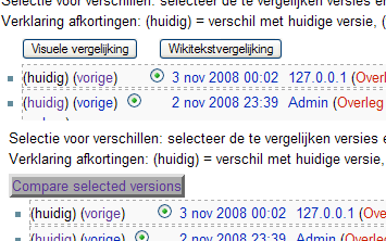
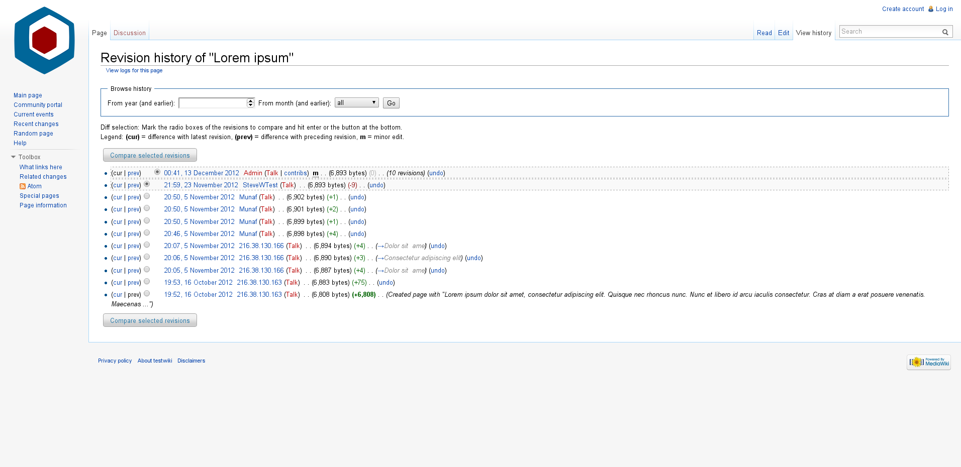
There is a rather popular workaround (http://en.wikipedia.org/wiki/User:Superm401/Compare_link.js) for this, however it makes far more sense to do this normally. Making the button a link allows basic usability stuff like opening your diff in a new window, and generally seems like an obvious thing to do.


Version: unspecified
Severity: enhancement

Details

Reference
bz16165

Event Timeline

bzimport raised the priority of this task from to Medium.Nov 21 2014, 10:16 PM
bzimport set Reference to bz16165.

mike.lifeguard+bugs wrote:

Since most of this is already done by that script, I believe it would be an easy thing to fix. Marking as such.

A link would require JavaScript, so the button would still be needed as a fallback (but could be hidden for JS-able users).

mike.lifeguard+bugs wrote:

Changes the button to a link

attachment history.patch ignored as obsolete

mike.lifeguard+bugs wrote:

Uses the form id, per Splarka's advice

After MrZMan added ids to the forms in r42736, I used the id to find the form.

attachment history.patch ignored as obsolete

I like the button better, but maybe that's just me. But not worth a userpref over it...

herd wrote:

Some comments (per Mike's request):

  • It should reference the existing input buttons for removal by ID, rather than location (nextSibling, and [1]). More IDs plz Mr-Z!
  • It screws up with visual diffs (on test.wp for example), due to referencing the inputs by location rather than ID
  • It should do more abort checks, like "if(!histForm) return", it assumes elements too much.
  • It probably shouldn't use insertBefore() implicitly, but have an appendChild fallback... ? (not sure if the older browsers with problems in this area make a significant demographic anymore)
  • Personal preference: it should style the links (with appendCSS() or inline) to look a bit like buttons, like {color:black;text-decoration:none;border:2px outset #aaaaaa;background-color:#aaaaaa}. But not critical.

<noscript> could deal with the input buttons with no need for removal per se. :)

+var genLink = wgServer + wgScript + "?title=" + histForm.title.value + "&diff=" + histForm.diff[diffInd].value + "&oldid=" + histForm.oldid[oldInd].value;

This bit fails to URL-escape the title component, so will fail for some pages such as [[AT&T]].

mike.lifeguard+bugs wrote:

Updated patch, includes ids in PageHistory.php and some fixes per Splarka

attachment history2.patch ignored as obsolete

Created attachment 5508
Before and after patch 5507

Few remarks:
(1) This does not play nice with $wgEnableHtmlDiff = true;. See screenshot with before and after
(2) no i18n for the button

Attached:

before-and-after.png (222×355 px, 17 KB)

Hey. I'm the original author of this script (http://en.wikipedia.org/wiki/User:Superm401/Compare_link.js). It would be great to see it enabled by default.

I'm attaching a patch to fix #2 (by explicitly copying the original button value). Also, there is one more sanity check to make sure elements are returned from getElementsByClassName.

Finally, I'm not listed anywhere as the original author of the script. Can someone please put this in the appropriate place when committting?

Created attachment 5509
Simple (but effective) internationalization + one more sanity check

Updated JS patch. Does internationalization and adds a sanity check.

attachment i18n_and_sanity.patch ignored as obsolete

I'm attaching another patch, replacing 5507 and 5509. Those were both non-functional (which I would've noticed if I'd tested the modified version...). Brackets were added around two if statements in the wrong place, causing an infinite loop.

I've upgraded the code to handle HTML diffs fully, and in general cleaned it up (using a namespace to store data rather than inefficiently repeat work.

I also made some CSS changes to make the button-links look better. I'm still not sure the button-like style is a good idea, because it may confuse the user. But if we want them to look like buttons, at least they should look like /proper/ buttons.

Finally, I avoided clobbering the onchange.

Created attachment 5511
Fix infinite loop bug, add support for HTML diffs, tweak style and make implementation neater

attachment compare_with_i18n_and_html.patch ignored as obsolete

OK, I tested attachment 5511, and it looks quite alright. Old buttons are present when JS is disabled, localisation is there for the button texts, and the design is consistent when HTML Diff is enabled.

Not too happy about the button colours, though. They are really dark, and it appears to break 'visual unity'. Could you try and get them to use the same text colour and background as the old button? See attachment 5508.

Well, the problem is the "old button" color is not defined anywhere. So there's no way we can guarantee the link's background matches.

(In reply to comment #16)

Well, the problem is the "old button" color is not defined anywhere. So
there's no way we can guarantee the link's background matches.

I think that not changing default behaviour would be a safe assumption here. The screen shot has been made without any style changes.

I think that not changing default behaviour would be a safe assumption here.

That's only default in your browser. There's no guarantee other browsers would behave similarly. It's possible to instead use computed/current style, but that's somewhat hackish.

For now, I've attached a version using the default color from my Firefox 3. Note that this is not the same as your browser.

Created attachment 5512
With lighter button color

attachment with_color_change.patch ignored as obsolete

mike.lifeguard+bugs wrote:

Matthew obviously is better equipped to handle this. Thanks.

mike.lifeguard+bugs wrote:

(In reply to comment #6)

  • Personal preference: it should style the links (with appendCSS() or inline)

to look a bit like buttons, like {color:black;text-decoration:none;border:2px
outset #aaaaaa;background-color:#aaaaaa}. But not critical.

After thinking about that one more, I think it should be a plain link. However, if not I will just override it for myself :)

FT2.wiki wrote:

Now that bug 16607 is fixed and live, can the two buttons at the top of a history page be changed to links for usability (per that thread and this one)? Thanks.

FT2.wiki wrote:

Changing title to cover both buttons, now there are 2 of them.

mike.lifeguard+bugs wrote:

Actually, there are three. HTML diff isn't used on Wikimedia, but it should be a link too. That's one main fault with the patch I submitted earlier, since I didn't know that button existed at all.

Matthew, are you still interested in implementing this?

Sure, Mike. However, looking at Wikipedia history pages, I don't see a second button yet. Also, I haven't heard any reaction to attachment 5512.

mike.lifeguard+bugs wrote:

(In reply to comment #25)

Sure, Mike. However, looking at Wikipedia history pages, I don't see a second
button yet. Also, I haven't heard any reaction to attachment 5512 [details].

Yes, as I said, Wikimedia doesn't use html diff. But the patch still needs to change that to a link if the wiki is configured appropriately.

  • Bug 22997 has been marked as a duplicate of this bug. ***

Reverted in r91547; to be reapplied later

sumanah wrote:

Comment on attachment 5511
Fix infinite loop bug, add support for HTML diffs, tweak style and make implementation neater

No longer applies cleanly to trunk; obsolete per automated testing by Rusty,
http://lists.wikimedia.org/pipermail/wikitech-l/2011-November/056340.html

sumanah wrote:

Comment on attachment 5512
With lighter button color

No longer applies cleanly to trunk; obsolete per automated testing by Rusty,
http://lists.wikimedia.org/pipermail/wikitech-l/2011-November/056340.html

sumanah wrote:

Matthew, I'm sorry for the wait. As you can see in https://www.mediawiki.org/wiki/Special:Code/MediaWiki/86047 there was some code review of the patch and it ended up being reverted due to issues that some developers raised. If you have the time and the interest to revisit the issue, we'd welcome discussion in the MediaWiki-General channel on freenode IRC -- that might be a good place to discuss approach. Thank you for your contribution and again, sorry for the wait.

Alright, I'm making another go at this (https://gerrit.wikimedia.org/r/#/c/38915/). It's a simpler implementation, leveraging jQuery UI and the existing code. It doesn't interfere with the submit handling (cloning forms and such), because I think that handles some deletion buttons this doesn't.

This request presents a serious design issue.

History pages are confusing and link-covered enough as it is. Adding a javascript workaround to remove some of the differentiation between components is not going to help matters when, for the user, the only thing attaching these buttons to their selections is the fact that they are visibly buttons. There is no other visible mapping between them at present, not positional nor in terms of style, and the entire history page layout would need to be reworked before a more proper solution would be viable.

Lacking that, however, such a change as this does not belong in core.

Created attachment 11522
Screenshot of new compare button

Attached:

Lorem_Ipsum_Compare_Selected_Revisions.png (930×1 px, 141 KB)

Isarra, did you try the code? It is still quite visibly a button, just a jQuery UI button, not a native one. No one could mistake it for "just another link". I have attached a screenshot showing that

I also don't agree that "the only thing attaching these buttons to their selections is the fact that they are visibly buttons". The text itself (e.g. "Compare selected revisions") attaches them, since there is nothing besides the checked radio buttons that is plausibly a selection.

I am glad to consider improvements to the button styling (there is a lot of possible flexibility, including icon, color, and more), but I don't think it's reasonable to reject the change wholesale until the whole layout is redesigned (even though a separate redesign could be quite valuable).

(In reply to comment #35)

Created attachment 11522 [details]
Screenshot of new compare button

That helps, but presents another problem - those 'buttons' don't match other buttons, including default and other styled 'buttons' in various extensions and places. Is that supposed to be the standard style? If so, then excellent, but then why has it not been applied more generally? And if not, then it should not be used here; whatever is the standard should be.

Or is there a standard?

Attached:

Lorem_Ipsum_Compare_Selected_Revisions.png (930×1 px, 141 KB)

I'm with Isarra. I see no reason to do this; you can open forms on new page by clicking Shift when clicking the submit button (just like you can when clicking a link).

I was commenting on the bug and what you said was done, not on the code itself, as the checkout process is quite troublesome. Apologies for the confusion, although I perhaps should point out that buttons that look like buttons but don't act like buttons is pretty silly from a usability perspective as well.

There is an in-progress standard at https://www.mediawiki.org/wiki/Style_guide/Forms#Buttons, and I have followed it (though using a minimal set).

There are plans to introduce Agora styling more broadly (e.g. the way the account creation page currently looks).

I believe this should be a skin for jQuery UI, and Munaf (one of the people working on Agora) seems amenable to this though a final decision has not been made. If this is done, this button will fall into line, and I am willing to tweak classes as needed.

In short, there is no current definitive standard, but I will ensure this is kept updated to take advantage of the upcoming one.

Isarra, you don't need to check anything out just to read the proposed change. You can do it all in the Gerrit web interface. I don't think this poses any usability problem. It doesn't take anything away from people who just click the button.

Bartosz, that's the *only* thing you can do. You can't copy them, see the visited state, or right-click to use the menu, all of which people commonly do with links.

Bartosz, among other things, buttons don't give you the flexibility of easily choosing, current page, new window, or new tab.

I'm sorry. Clearly I can't read, although when things don't do what they say on the tin that never helps.

Buttons act a certain way. If they act differently, that forces users to relearn what to expect from them. If some buttons that look the same as others act differently from each other, then users won't know what to expect at all, or will expect the wrong things and be confused.

Isarra, I apologize for any confusion. I said here it used jQuery UI, and the code uses jQuery UI Button, which you can tell from the web interface (including the commit message).

jQuery UI button emulates all the key behavior of native buttons, including clicking (obviously), active state (works, though the styling could be tweaked), and disabled (though it is not applicable here; like before, if you see it you can use it).

If you can identify any confusing behavior of this button, I'll be glad to fix it.

I guess my point is even if folks can do fancy non-button things with the buttons, if they still appear as buttons, people won't expect the non-button things. And once someone does figure it out and shares the knowledge, then the expectation in general will change and that will just result in more confusion when dealing with other, normal, buttons.

If the functionality is needed, don't change the buttons to act like non-buttons, but instead look to *what* buttons/links are present. Users expect certain things when they see certain cues - thus we have patterns in design putting those expectations to use, and not following these patterns, while it can work well in some cases and even in time change the existing patterns, needs to be done very carefully.

"people won't expect the non-button things"

That will be true for some people, but it's not a problem caused by this change.

"And once someone does figure it out and shares the knowledge, then the
expectation in general will change and that will just result in more confusion
when dealing with other, normal, buttons."

I just don't think that's likely. People informed enough to use the link behavior are less likely to get confused that way. As Mike indicates, this is already available on English Wikipedia, and the current version looks like a button (though not a jQuery UI one).

No one has told me it confused them (or someone else) about other buttons.

There are a few other buttons used in a similar way (getting public info through making choices than hitting a button) on MediaWiki, but they're mostly on special pages.

This is the only one I can think of that's critical to people's workflows.

(In reply to comment #46)

"people won't expect the non-button things"

That will be true for some people, but it's not a problem caused by this
change.

It is, however, a problem with the change - if the functionality is hidden, and if there is a real need for it, then that is a problem. Given that this is a somewhat heavy-handed js workaround, I would hope that there is indeed a real need for it if it is to be added to core.

"And once someone does figure it out and shares the knowledge, then the
expectation in general will change and that will just result in more
confusion
when dealing with other, normal, buttons."

I just don't think that's likely. People informed enough to use the link
behavior are less likely to get confused that way. As Mike indicates, this
is
already available on English Wikipedia, and the current version looks like a
button (though not a jQuery UI one).

No one has told me it confused them (or someone else) about other buttons.

In many cases this may already be expected behaviour, as modern browsers (chrome and opera, at least) support such functionality already, but as most people indeed do not know about this at all, of course it will not confuse them.

If some people want this and it's not supposed to affect others, why does it belong in core?

It is, however, a problem with the change - if the functionality is hidden, and
if there is a real need for it, then that is a problem.

It's not hidden at all. The mouseover behavior indicates that it
behaves like a link. Some people won't get that cue, but a lot will.

Given that this is a somewhat heavy-handed js workaround, I would hope that there is indeed a real
need for it if it is to be added to core.

There is a need, and that's why people are using it on en wiki, and why
someone else asked for it to be added to core.

No one has told me it confused them (or someone else) about other buttons.

In many cases this may already be expected behaviour, as modern browsers
(chrome and opera, at least) support such functionality already, but as most
people indeed do not know about this at all, of course it will not confuse
them.

I'm actually not sure if that's true. Shift-click does not work for me
in Firefox or Chrome.

If some people want this and it's not supposed to affect others, why does it
belong in core?

It is valuable to a large enough group already to justify core, and the
fact that it's *exposed* on mouseover (very unlike these possible Shift
solutions) will make it useful to others (even without docs, but of
course we will write those too).

As mentioned, it's also way more flexible than any "just open in a new
window" built-in feature.

In response to Change-Id: I1b8051549edcc5bccadbc89253daadefcdbcfe0d (Patch set 5)

We don't use jQuery UI buttons anywhere in core, this it not the place to "randomly" start using them. It would be the only button anywhere that uses this style. There are some people working on stylesheets that will allow a consistent styling between links and buttons (to not require visual distinction for cases where it doesn't make sense to the user), but avoid adding more inconsistency.

The use case of opening the diff in a new window is valid, but rare (mostly for power users). However, regardless of the target audience, this contradicts the expectation pattern it claims to solve. People know that form submission can't be "opened" in a new window, only links or target buttons can be opened in a new window (The Issue page on GitHub is a good example. The Pull request button and other buttons on top look like buttons but are <a> links. The form submit button, looking similar, is not a link because it submits a form. The user is aware of that and it works intuitively.).

This diff button is a grey area. It UX is not like a form submission, but not like a plain link either.

But whatever the case, by making it the only button in MediaWiki that can be
"opened" in a new window, is that an improvement? Users would still be expecting the same (a button can't be opened in a new window). So it wouldn't really solve anything.

And then there is consistency, why only this button and not the 100s other butons in MediaWiki?

Again, a valid use case, but not something that should be duck-punched locally in one specific module.

And besides, it is a very trivial case. The information is accessible, the page can be opened, just not with the ability to right-click it as a link.

We do use jQuery UI buttons in core. mediawiki.feedback depends on jquery.ui.dialog, which in turn depends on jquery.ui.button.

The fact that it looks like a link on mouseover (including URL in status bar for applicable browsers) is a powerful hint that it can be used as a link. I agree not every user will pick up on this, but enough will (even without reading about it) to justify core.

As I said, there are not really any other buttons that are used the same way in MediaWiki. The ones used in a vaguely similar way are in special pages, not right there in the workflow.

There are many common use cases where this speeds things up:

  1. Opening diffs in a new tab
  2. Copying diffs to a talk page
  3. Assembling multiple diffs for some kind of report

This is worth making easier. The fact that it isn't extremely hard as is is not a reason against making it easier.

(In reply to comment #38)

I'm with Isarra. I see no reason to do this; you can open forms on new page
by
clicking Shift when clicking the submit button (just like you can when
clicking a link).

Not when using

  • Google Chrome 22.0.1229.94, on Ubuntu 12.10
  • Firefox 17.0.1, on Ubuntu 12.10 or Windows XP
  • Internet Explorer 8, on Windows XP
  • Google Chrome 23.0.1271.97 m, on Windows XP

(In reply to comment #51)

We do use jQuery UI buttons in core. mediawiki.feedback depends on
jquery.ui.dialog, which in turn depends on jquery.ui.button.

But "mediawiki.feedback" and "jquery.ui.dialog" are not used in core:

It's true that nothing in core depends on mediawiki.feedback. But it is still a feature provided by core and used by major extensions such as VisualEditor and UploadWizard.

There's nothing stopping us from using jQuery UI in one more place in core.

I could still do this without jQuery UI. But I think it makes more sense to use it. That way, we have the flexibility to change the jQuery UI theming anytime (e.g. to Agora) and have it affect usages such as this and mediawiki.feedback (and whatever else).

(In reply to comment #51)

We do use jQuery UI buttons in core. mediawiki.feedback depends on
jquery.ui.dialog, which in turn depends on jquery.ui.button.

Yes, inside dialogs. That's a very different context than in the middle of a regular page.

This can be updated/merged after bug 71141 (enable conditional use of mw-ui-button on the history page depending on the wgUseMediaWikiUIEverywhere global, while keeping it a button, rather than a link), and bug 70913 (roll out MW UI buttons to general UI, setting that global to true and then removing it).

At that point, it will look like a MW UI button either way, and it won't look out of place because those button styles will have rolled out widely by then.

@mattflaschen, this is one of the oldest tasks assigned to someone. Are you planning to work on it, and is its current priority correct?

In T18165#970574, @Qgil wrote:

@mattflaschen, this is one of the oldest tasks assigned to someone. Are you planning to work on it, and is its current priority correct?

Right now, it's blocked by T72913: Remove $wgUseMediaWikiUIEverywhere dependency for button and text input styling. That's because I think it makes sense to do this after the current <button> starts using MW UI unconditionally (at that point, this bug will only involve changing which element the button uses).

(Of course, if OOJS-UI makes a lot of quick progress, things may change too).

I am still interested in doing it after the blocker is resolved, but I'm not actively working on either, so I've unassigned per your request.

In T18165#978535, @Mattflaschen wrote:

Right now, it's blocked by T72913: Remove $wgUseMediaWikiUIEverywhere dependency for button and text input styling. That's because I think it makes sense to do this after the current <button> starts using MW UI unconditionally (at that point, this bug will only involve changing which element the button uses).

(Technically it's an <input type="submit"> now).

Aklapper changed the subtype of this task from "Task" to "Feature Request".Feb 4 2022, 12:24 PM